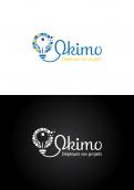
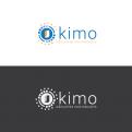
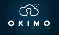
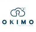
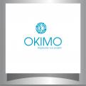
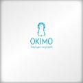
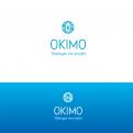
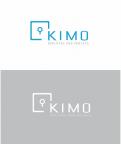
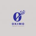
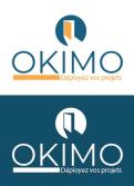
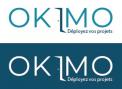
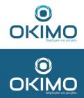
Logo for private real estate investor - real estate match maker for business project !
Contest details:
Bronze
- Contest holder: BFI
- Category: Logo design
- Total budget: € 269.00
- Start date : 22-11-2017 15:34
- Ending date : 22-12-2017 00:00
- Status : Ended
- Required formats: jpg,psd,ai,pdf,png
- Relevant files: None
-
Available languages:


- Number of designs: 176
-
Response rate:
low high
Needs:
Our mindset is not that of the traditional real estate of "proposing premises". Our credo is to offer "spaces of creativity and deployment of projects". The positioning is totally different. In addition, we maintain a relationship with the tenant throughout the duration of his lease, we are more than an intermediary.
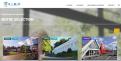
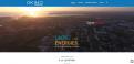
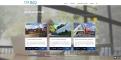
In addition to the more specific information below, we are attaching some visuals of the new site to better understand the graphic charter and the insertion of the logo.
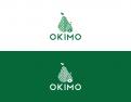
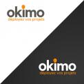
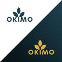
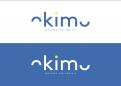
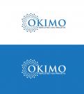
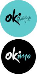
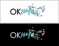
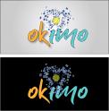
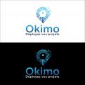
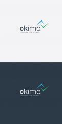
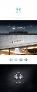
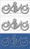
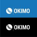
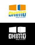
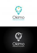
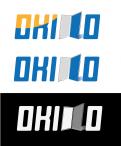
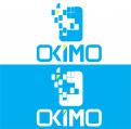
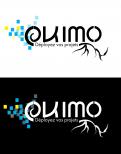
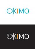
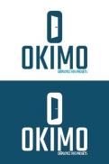
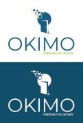
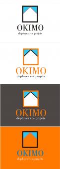
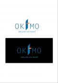
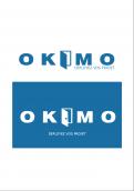
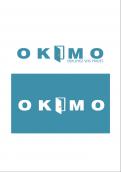
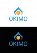
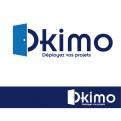
The logo must have at least 2 versions: one for white background (colored) and one for dark background (white). If you add an illustration, please plan its variant horizontally AND vertically. For the delivery of the logo the formats .ai as well as .psd will have to be provided with all the editable layers.
Company description:
We are neither a real estate agency nor an asset manager. We are investors and put directly our own tertiary and commercial premises for rent.
Target group:
We mainly offer shops and office space, so we operate in BtoB (merchants, SMEs, associations and administrations).
Colors, favourites and other requirements
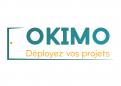
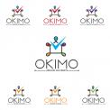
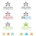
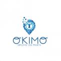
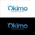
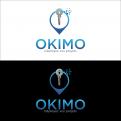
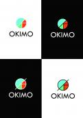
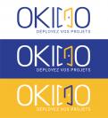
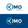
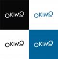
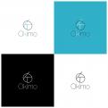
Regarding colors, we stay in something more traditional, namely: dominant blue and touches of yellow, even more sporadically a little orange and green (see attached files for some visuals of the website). You have to stay sober because of our activity, but still evoke the dynamism and creativity of our tenants.
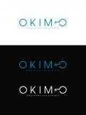
Regarding typography, you have to work on it. For the website, we use Roboto, some elements are put forward using the font Shadows Into Light 2 of Google Font. You can use others, it is probably even recommended, it must be clean, professional and modern yet.
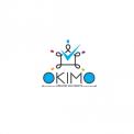
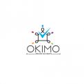
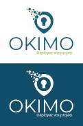
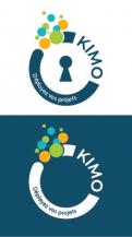
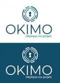
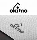
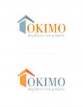
Regarding the illustrations finally, we do not want roof, house or images making too direct reference to real estate. At most something like a door that opens (just an example, it's up to you, your creativity is totally free !). We really want to stand out from the real estate agency and aim for something more focused on projects and collaboration. We offer spaces to realize the business ideas of our tenants.
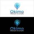
You can choose whether or not to include a baseline with the logo. In this case, it would be "Déployez vos projets".
-
designer: krisi
-
designer: dmproduction
-
designer: m.amina
-
designer: m.amina
-
designer: joyanto93
-
designer: ROSHAN
-
designer: ROSHAN
-
designer: Yohan-Bonnet
-
designer: sariaka
-

designer: sariaka
-
designer: susili
-
designer: Y.A.Design
-
designer: Infinity Graphics
-
designer: sariaka
-
designer: sariaka
-
designer: krisi
-
designer: zarkovzi
-
designer: Rexen
-
designer: NANO
-
designer: NANO
-
designer: NANO
-
designer: krisi
-
designer: zlatojescrv
-

designer: update
-

designer: update
-
designer: update
-
designer: update
-
designer: update
-
designer: tennisloool
-

designer: tennisloool
-

designer: tennisloool
-

designer: atoll2030
-

designer: atoll2030
-
designer: atoll2030
-
designer: mtor
-
designer: atoll2030
-
designer: AMADDAMA
-
designer: Auquier Philippe
-
designer: AMADDAMA
-
designer: Showcaze
-
designer: krisi
-
designer: umbra
-

designer: tennisloool
-

designer: Dadaist
-
designer: mihawk
-
designer: mihawk
-
designer: mihawk
-
designer: Wilko
-

designer: Wilko
-
designer: solaram
-
designer: KUgraphics
-
designer: rabii
-
designer: KUgraphics
-
designer: rabii
-
designer: rabii
-
designer: rabii
-
designer: rabii
-
designer: rabii
-
designer: rabii
-
designer: KUgraphics
-
designer: KUgraphics
-
designer: rabii
-

designer: rabii
-

designer: rabii
-
designer: rabii
-

designer: rabii
-
designer: M3kdesign
-
designer: rabii
-
designer: rabii
-
designer: rabii
-
designer: KUgraphics
-
designer: M3kdesign
-
designer: KUgraphics
-
designer: KUgraphics
-
designer: KUgraphics
-
designer: KUgraphics
-
designer: Y.A.Design
-
designer: ninisdesign
-

designer: ninisdesign
-
designer: ninisdesign
-
designer: ninisdesign
-
designer: ninisdesign
-
designer: Li70
-
designer: Li70
-
designer: arnaudparret
-
designer: arnaudparret
-
designer: arnaudparret
-
designer: auphélie
-
designer: auphélie
-
designer: Strom
-
designer: NANO
-
designer: AMADDAMA
-
designer: niki
-
designer: diyama
-
designer: diyama
-

designer: Ismael Toure
-
designer: amit kumar
-
designer: amit kumar
-
designer: ngahoang
-
designer: kalea
-
designer: kalea
-
designer: ninisdesign
-
designer: arnaudparret
-
designer: Rusty_Saffir
-
designer: Rusty_Saffir
-
designer: NANO
-

designer: The Libran™
-
designer: The Libran™
-

designer: arnaudparret
-

designer: arnaudparret
-

designer: arnaudparret
-
designer: Blueprint
-
designer: krisi
-
designer: Blueprint
-
designer: mobiludik
-
designer: mobiludik
-
designer: Onylou
-
designer: shanks
-
designer: shanks
-
designer: mihawk
-
designer: mihawk
-
designer: Simke
-
designer: Simke
-
designer: Simke
-
designer: Simke
-
designer: Simke
-
designer: Cristi.Bordeianu
-
designer: Li70
-

designer: shanks
-
designer: shanks
-

designer: tennisloool
-
designer: aditya.singh121
-
designer: aditya.singh121
-

designer: aditya.singh121
-
designer: Simke
-
designer: Simke
-

designer: Simke
-
designer: moufida
-
designer: moufida
-
designer: moufida
-
designer: jefry
-
designer: moufida
-
designer: MmePandart
-
designer: MmePandart
-
designer: moufida
-
designer: VirtualLies
-
designer: rbbrln
-
designer: ndejanovic
-
designer: ndejanovic
-
designer: ndejanovic
-
designer: umbra
-
designer: Art32
-
designer: Art32
-
designer: Art32
-
designer: dop kreativ
-
designer: moufida
-
designer: Simke
-
designer: Simke
-
designer: Simke
-
designer: Xsam12500
-
designer: Simke
-
designer: darina
-
designer: Wilko
-
designer: VirtualLies
-
designer: Cristi.Bordeianu
-
designer: AMADDAMA
-

designer: selenia
-
designer: manouia
-
designer: logomaker
-
designer: logomaker
-
designer: Graphikomaniak
-
designer: umbra
-
designer: umbra
-
designer: radhouen12
-
designer: sariaka
-
designer: radhouen12