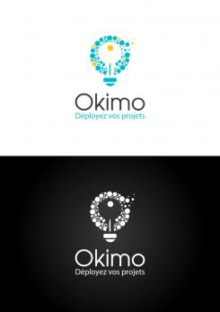
Logo for private real estate investor - real estate match maker for business project !
Contest details:
Bronze
- Contest holder: BFI
- Category: Logo design
- Total budget: € 269.00
- Start date : 22-11-2017 15:34
- Ending date : 22-12-2017 00:00
- Status : Ended
- Required formats: jpg,psd,ai,pdf,png
- Relevant files: None
-
Available languages:


- Number of designs: 176
-
Response rate:
low high
Needs:
Our mindset is not that of the traditional real estate of "proposing premises". Our credo is to offer "spaces of creativity and deployment of projects". The positioning is totally different. In addition, we maintain a relationship with the tenant throughout the duration of his lease, we are more than an intermediary.
In addition to the more specific information below, we are attaching some visuals of the new site to better understand the graphic charter and the insertion of the logo.
The logo must have at least 2 versions: one for white background (colored) and one for dark background (white). If you add an illustration, please plan its variant horizontally AND vertically. For the delivery of the logo the formats .ai as well as .psd will have to be provided with all the editable layers.
Company description:
We are neither a real estate agency nor an asset manager. We are investors and put directly our own tertiary and commercial premises for rent.
Target group:
We mainly offer shops and office space, so we operate in BtoB (merchants, SMEs, associations and administrations).
Colors, favourites and other requirements
Regarding colors, we stay in something more traditional, namely: dominant blue and touches of yellow, even more sporadically a little orange and green (see attached files for some visuals of the website). You have to stay sober because of our activity, but still evoke the dynamism and creativity of our tenants.
Regarding typography, you have to work on it. For the website, we use Roboto, some elements are put forward using the font Shadows Into Light 2 of Google Font. You can use others, it is probably even recommended, it must be clean, professional and modern yet.
Regarding the illustrations finally, we do not want roof, house or images making too direct reference to real estate. At most something like a door that opens (just an example, it's up to you, your creativity is totally free !). We really want to stand out from the real estate agency and aim for something more focused on projects and collaboration. We offer spaces to realize the business ideas of our tenants.
You can choose whether or not to include a baseline with the logo. In this case, it would be "Déployez vos projets".
krisi
-
-
krisi says
Hello,
here two versions of the logo : white and color.
Let me know if you need something else.
Regards,
Krisi -
This contest is finished. Its not possible to reply anymore.
-
-
-
krisi says
Hello,
here last adjustments.
Let me know what do you think about two versions with logo next to the name and logo above the name.
Regards,
Krisi -
BFI says :
Hello krisi,
Sorry for the delay. The logo looks really good now !
For the colored version, here is what i've just made : seaflats.com/wp-content/uploads/2017/12/Okimo colors.jpg
As you can see, the colors are much more discrete and only by small touch. Here are the colors code :
For yellow : #c7b30b
For purple : #4a0771
For green : #0d6c64
For dark blue (the key) : #08446d
For light blue : #1776b8
The best is that you update the logo with these colors, and then, as it's requested in the brief, to send us an editable file with all the layers in psd and ai.
Once you'll do the color version for horizontal and vertical version, with the white version here attached and added, it will be perfect. The contest ends tomorrow.
Oh and by the way, we have just noticed it was you that realized our other logo, the one for our holiday rental "Seaflats" ! It's great to see that it's you once again that grab our attention !
Have a good end of week. -
This contest is finished. Its not possible to reply anymore.
-
-
-
krisi says
Hello,
I work on the font and I make it more readable.
I think now the "Okimo"is much more clear.
I also make changes with colors so they can fit better with your website.
I make the bulb image a smaller so "Okimo" looks bigger on smaller size.
Let me know what do you think about this adjustments.
Regards,
Krisi -
BFI says :
Hello Krisi,
Thanks for your improvements.
We though about it today. I had a new idea that seems to satisfy everyone, could you stylised it ? I've modify your file (as I can ! I'm not really a webdesigner ;) ) and you can view the result here : http://seaflats.com/wp-content/uploads/2017/12/Logo krisi v2.jpg.
As you see, here are what we finally need :
1. Incline the light bulb
2. Wrap the cable a little bit as if it were putted down the ground
3. Put back the queue on the last "O" and add a little end that escape it
Then can you add the vertical version stylised this way also ?
For now, we only work on the white version, I will send you another file with our wish for the colored one.
I think we are very near from what we want now. -
This contest is finished. Its not possible to reply anymore.
-
-
-
krisi says
Hello,
here my first adjustments.
Let me know what do you think.
Regards,
Krisi -
BFI says :
Hello Krisi and thank your for your work !
It looks good, but here are our new remarks to make it perfect :
1. Some people didn't understand the first letter was a O, so they didn't read our name as Okimo but Kimo. I liked the way it turns but if it's not readable, it should be revised.
2. I like the cable connecting the light bulb to the brand name. As the font should be revised to be more readable, could you for example make the cable thinner between the illustration and the name, and also between letters ? I don't know if it will render well, if you don't think so don't make it.
3. Regarding the font, the first one was too classic, but even if I like the newest, it's perhaps a little bit too funky for a real estate business. Could you find something between these two proposition ?!
4. When I tried to add this logo to our website, it looks good on the home page, but the name isn't readable when I put it on our menu and on the sticky header because the illustration is bigger and catch all the attention. What about putting it onto the first letter and also the cable ? Would it be better ? I want we still see this beautiful illustration, so I'm afraid it would appear too small ?
5. Last remark (but all the ones are about the same thing after all), the main blue of the logo doesn't fit our graphic charter. We are more on a deeper one, like this : #1676B7. We also have a warm yellow, a touch of light blue-green and also of deep purple but just on the homepage. The yellow you've integrated first was nice because it's also on our website, but the key wasn't noticeable, it's better now. Perhaps it could be added only in some bubbles of the bulb ?
This is a long reply but we are really interested by your proposition.
Have a good week-end ! -
This contest is finished. Its not possible to reply anymore.
-
-
-
BFI says :
Bonsoir, (english version below this one)
Nous avons rouvert le concours car nous avons eu un gros dossier à gérer la 1ère fois. Votre logo nous a particulièrement plu car il regroupe tous nos critères concernant l'illustration très ingénieuse ! (l'ampoule pour les idées, les bulles pour les projets et la clé pour l'immobilier). Mais nous aurions besoin de quelques modifications avant de faire notre choix définitif :
1. Il faut proposer une version du logo horizontale, celle en verticale est nécessaire mais sera bien moins utilisée que l'horizontale. Il ne suffit pas de mettre l'illustration à gauche pour cela.
2. Nous avons tous trouvé que le logo en couleurs ressortait moins bien que celui sur fond noir. Plusieurs personnes n'ont pas vu la clé dans la version couleur au premier regard. Donc : dans un premier temps, il faut changer les couleurs qui ne correspondent pas à notre charte graphique (voir fichiers joints sur la page du concours) et voir comment lui donner autant d'impact que la version en noir et blanc.
3. Serait-il possible de styliser un peu plus la typographie ? Une idée m'est venue, mais vous êtes totalement libre de proposer autre chose : relier l'illustration au nom Okimo en faisant comme si c'était le câble de l'ampoule qui dessinait le nom du logo.
Merci pour ces premiers ajustements. Nous vous tenons informé et avons beaucoup apprécié votre travail.
-------------------------------
Good evening,
We reopened the contest because we had a lot of work the first time.
Your logo was particularly popular and appreciated because it includes all our criteria for the very ingenious illustration! (the bulb for ideas, the bubbles for projects and the key for real estate). But we would need some modifications before making our final choice:
1. It is necessary to propose a version of the horizontal logo, the one in vertical is necessary but will be much less used than the horizontal one. It is not enough to put the illustration on the left for that.
2. We all found that the logo in color was not as good as the logo on a black background. Many people did not see the key in the color version at first sight. So: first, you have to change the colors that do not correspond to our graphic charter (see attached files on the contest page) and see how to give it as much impact as the black and white version.
3. Would it be possible to stylize a little more the typography? An idea came to me, but you are totally free to propose anything else: to connect the illustration to the name Okimo by pretending that it was the cable of the light bulb that drew the name of the logo.
Thank you for these first adjustments. We keep you informed and really love your work. -
krisi says
Hello,
Thank you for your feedback.
I will work on adjustments and when I am ready I will upload new version.
Regards,
Krisi -
This contest is finished. Its not possible to reply anymore.
-

