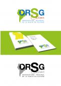
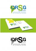
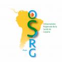
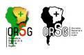
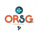
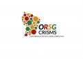
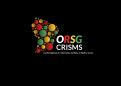
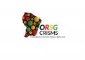
Logo for the Regional Health Observatory of Guyana
Contest details:
Gold
- Contest holder: ORSG
- Category: Logo & stationery
- Total budget: € 479.00
- Start date : 01-09-2014 18:23
- Ending date : 01-10-2014 18:16
- Status : Ended
- Required formats: jpg,psd,ai,pdf
- Relevant files: None
-
Available languages:


- Number of designs: 82
-
Response rate:
low high
Needs:
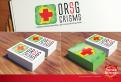
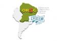
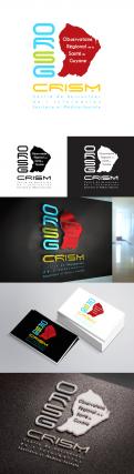
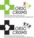
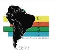
Since 2011, the organisation reaffirms its bases for its evolution to CRISMS.
In 2014 we have, to highlight the CRISMS by renewing and updating the logo. We need to create a positive image about the uniqueness of the identity of the Regional Health Observatory of Guyana-CRISMS.
The goal for the RHOG-CRISMS is to communicate its image and its productions, to develop and promote new activities
Note: An initial design work was done by the communication team of RHOG. However, your proposition must learn from our realization without conflicting with your artistic sensibility.
THREE WORDS THAT WE would like THAT THE PUBLIC ASSOCIATE ROHG UNDER THE
NEW LOGO:
Stability: Durability of the structure in the time and its geopolitical climate.
Innovation: Proposals force in the areas of health and the means used to observe and communicate.
Confidence : spontaneous belief in the professional value of the structure, this leaving no doubt on existing skills.
THREE WORDS THAT WE wouldn’t like THAT THE PUBLIC ASSOCIATE RHOG UNDER THE NEW LOGO
Exceeded: suggesting a structure certainly well established for 25 years in the administrative landscape of its territory, but that would not have been able to face the new challenges posed by a political context (one community), administrative / competitive and technological .
Confused: the logo must realize a stable and solid set which ensures the consistency of the organization and operation of the structure legitimacy implicite.
unprofesionnal: The graphic quality of the logo should emphasize the professionalism and the intrinsic qualities of the team that makes up the structure
You have to write the FRENCH INITIAL for you design.
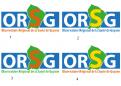
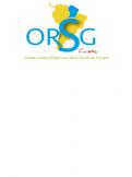
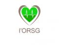
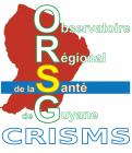
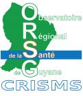
L’Observatoire Régional de la Santé de Guyane ( ORSG )
Regional Health Observatory of Guyana ( RHOG )
Company description:
The Regional Health Observatory of Guyana is a regional public institution of administrative nature and science-based.
To position itself as part of the implementation of the Territorial Community of Guyana in 2015, the RHOG has set a goal to structure communication.
From this perspective, the decision of the Regional Health Observatory of Guyana has highlighted the need to increase the visibility of the structure including the institutional evolution of the institution CRISMS (Regional Centre of Health Information and Social Medicine).
CRISMS mission (Resource Center for Health Information and Medical-Social) are:
-Collect, independently and in a sustainable way some files in an area on health issues national or local.
Attendance in better decision making based on recent updated data and exploited
-develop and adapt communication
Target group:
Any person (public or private) seeking information on the health in Guyana:
-Students
-Institution
-professionals Health
-Doctor
-researchers
Colors, favourites and other requirements
Readability of the logo:
o polices with clear characters, contrasting colors, simple shapes,
important stylization of graphic elements
oversion: color + black and white
o identifiable in different size
matrix and vector oformat:
JPEG 300 dpi (for printing internal documents)
GIF 72 dpi - RGB (for web use)
EPS vectorized (for printer)
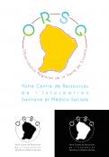
Explanation of the new logo that will serve as basis:
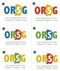
1 Choice of colors:
• Yellow: gold, Knowledge and Know
• Red-orange: laterite
• Green and Blue: associated with health care, research and public sector organizations.
2. forms:
The "S" of RHOG is highlighted by color and size to highlights our business: health and medico-social
Highlighting / relief map of Guyana on the South American territory: this characterizes the implementation of the French territory in a set of complex geopolitical issues.
The CRISMS appears on the logo as a handwritten signature and a slogan is readable (choice of typography, position and shape). The acronym should be visible through the choice of a different color.
Viewing
Website http: //www.ors-guyane.org ... (this website will be removed)
Design of the new website in the Appendix
Creating a new website
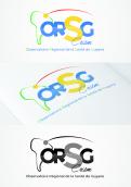
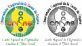
Logo Current logo
updated logo
Graphic chart Attached
-
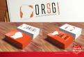
designer: eggy
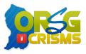
-

designer: Rikinho Creations
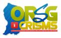
-

designer: Rikinho Creations
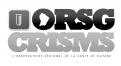
-
designer: NANO
-
designer: Creatieve Mastermind
-
designer: graficoc
-
designer: Creatieve Mastermind
-
designer: Heuristique
-
designer: Heuristique
-
designer: Heuristique
-
designer: Heuristique
-
designer: Heuristique
-
designer: jolo
-
designer: NANO
-
designer: NANO
-
designer: limo
-
designer: Stéph BSG
-
designer: Stéph BSG
-
designer: Stéph BSG
-
designer: cipher
-
designer: Tomatt
-

designer: sa1nt
-
designer: RémiDup
-

designer: sa1nt
-
designer: rockindesigns
-
designer: aventicum
-
designer: rockindesigns
-

designer: drxbay
-

designer: drxbay
-
designer: Azedine designer
-
designer: Ludovic.amighetti
-
designer: Ludovic.amighetti
-
designer: Filplay
-
designer: jolo
-
designer: jolo
-
designer: Cyril70
-
designer: ROHAN JAGADEESH
-
designer: Rémi L
-
designer: Rémi L
-

designer: Juliee
-
designer: Bondaty and Co
-
designer: Bondaty and Co
-
designer: JuJo
-
designer: eggy
-
designer: cipher
-
designer: cipher
-
designer: plumegraphisme
-
designer: plumegraphisme
-
designer: jazy
-
designer: cipher
-
designer: cipher
-
designer: yoko&bjorn
-
designer: PerrinePaulin
-

designer: PerrinePaulin
-

designer: PerrinePaulin
-
designer: cipher
-
designer: Luis De Almeida Santos
-
designer: Luis De Almeida Santos
-
designer: MélanyC
-
designer: BIGSHEESE
-
designer: BIGSHEESE
-
designer: JuJo
-
designer: JuJo
-
designer: di-design
-
designer: aventicum
-
designer: aventicum
-
designer: aventicum
-
designer: aventicum
-
designer: aventicum
-
designer: limo
-
designer: Wilko
-
designer: Wilko
-
designer: Wilko
-
designer: Wilko
-
designer: Wilko
-
designer: charlie
-
designer: bwcreative
-
designer: willyann
-
designer: Amaz
-
designer: RoduitF
-
designer: plumegraphisme
-
designer: Filplay