New European Research institute
Contest details:
Silver
- Contest holder: chi666
- Category: Logo & stationery
- Total budget: € 419.00
- Start date : 20-02-2014 20:48
- Ending date : 06-03-2014 20:46
- Status : Ended
- Required formats: jpg,ai,pdf
- Relevant files: None
-
Available languages:


- Number of designs: 62
-
Response rate:
low high
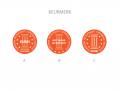
Needs:
Next to the logo we need a hallmark. This hallmark will be placed on a lot of company websites of big corporations. So it needs to be neutral, yet catching. In the hallmark there needs to be a reference to the logo, or it needs to be incorporated. This hallmark will be awarded to companies giving a good candidate experience.
key words:
International - European
Ambitious / modern
Recruitment
Experience
Research
Human
Normative
Company description:
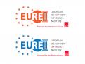
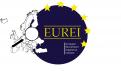
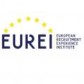
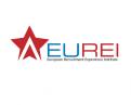
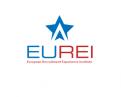
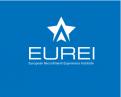
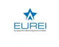
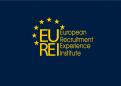
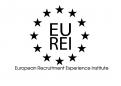
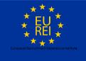
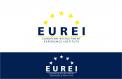
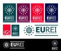
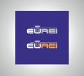
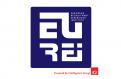
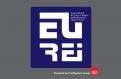
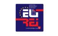
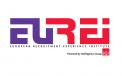
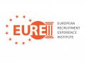
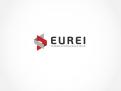
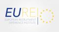
name institute: European Recruitment Experience Institute
for short: EUREI
EUREI is the international expansion of Digitaal-Werven. Digitaal-Werven has been a well respected Dutch research going 7 years. The institute wants to have the image of a genuine institution right away, without being old fashioned or inflexible.
Target group:
Our target audience are recruiters, recruitment managers and HR managers of large companies in all sectors. Like insurance companies, banks, fast moving consumer goods, accountants, IT companies.
Colors, favourites and other requirements
The logo might get a 'powered by Intelligence Group' with it, including the IG! logo (see file). We advise you to keep this in mind with the design and make sure the colors don't clash. It doesn't have to be the same color (preferably not), just don't let it clash.
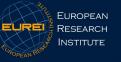
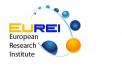
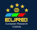
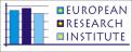
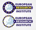
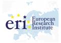
We want to have a different feel as our main competitors, like ERI (European Recruitment Institute). Logo is attached. And also as the Candidate experience awards (logo is attached as well). Make sure the logo looks significantly different.
Even though this is a continuation of Digitaal-Werven (www.digitaal-werven.nl) and we like this logo, it's typical Dutch. This new company is a European institute and most European countries are much more formal than the Dutch. So the logo needs to be more formal, yet not old.
-
designer: Millsend
-

designer: kaan
-
designer: Saskia_Sl
-
designer: sjoerd1990
-
designer: kurbix
-
designer: kurbix
-
designer: kurbix
-

designer: priya2014
-
designer: priya2014
-
designer: priya2014
-
designer: priya2014
-
designer: priya2014
-
designer: priya2014
-
designer: priya2014
-
designer: priya2014
-
designer: priya2014
-
designer: damjan
-
designer: Millsend
-

designer: CojaONIX
-
designer: Desya.Lovorov
-
designer: satyajit.s2010
-
designer: Zordana
-
designer: stevan banjac
-
designer: Multilumelo
-

designer: Multilumelo
-

designer: Bon13
-
designer: Multilumelo
-
designer: Multilumelo
-
designer: Bon13
-
designer: kaan
-

designer: kaan
-
designer: kaan
-
designer: kaan
-
designer: kaan
-
designer: kaan
-
designer: Andi12459
-

designer: Andi12459
-
designer: OpMaat
-

designer: CojaONIX
-
designer: OpMaat
-
designer: OpMaat
-
designer: CojaONIX
-
designer: CojaONIX
-
designer: twigga
-
designer: niki
-

designer: stevan banjac
-
designer: 4+
-
designer: 4+
-
designer: 4+
-
designer: stevan banjac
-
designer: Millsend
-
designer: 4+
-

designer: Brandbrains
-
designer: joop
-
designer: Millsend
-
designer: 4+
-
designer: Millsend
-
designer: Brandbrains
-
designer: Brandbrains
-

designer: Brandbrains
-
designer: niki
-
designer: chelik