Modernize logo for a practice for Shiatsutherapy Orthomoleculartherapy and foot reflexology
Contest details:
- Contest holder: Touchcare
- Category: Logo design
- Total budget: € 200.00
- Start date : 17-12-2021 13:12
- Ending date : 29-12-2021 00:00
- Status : Ended
- Relevant files:
-
Available languages:


- Number of designs: 130
-
Response rate:
low high
Needs:
We practice Shiatsu therapy since 2009 and have completed studies in the disciplines of Orthomolecular therapy and Foot Reflexology in recent years. The intention is that the logo will better reflect the new disciplines.
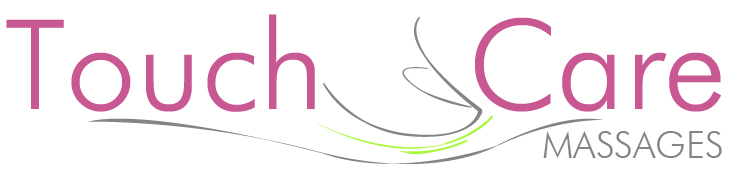
The attached logo is the current logo of the Shiatsu practice. This may be used as inspiration. Our goal is to modernize and freshen up the design.
In brief:
- Shiatsu literally means finger pressure and is a massage therapy comparable in diagnosis and treatment to Acupuncture, only without the needles.
- Orthomolecular therapy is a method of treatment in which optimal health is achieved and maintained through natural nutrition and supplementation in the form of vitamins and minerals and herbs.
- Foot reflexology is a therapy that restores natural balance and self-healing capacity of the body by treating reflex zones of the feet.
The logo needs to be:
- simple, - recognizable and unique; - and to propagate the disciplines within practice. The current logo symbolizes the disciplines Shiatsu and Foot Reflexology, but Orthomolecular is missing.
Company description:
Target group:
Colors, favourites and other requirements
amani
-
-
Touchcare says :
Dank je wel voor het ontwerp. Het is een opgefriste versie van ons logo, maar nog niet uniek genoeg. Het beeldmerk toont te weinig shiatsu en voetreflexologie en doet ons door de plaatsing op een gevel een beetje denken aan een reformzaak of een drogisterij.
Thank you for the design. It is a refreshed version of our logo, but not yet unique enough. The logo shows too little shiatsu and foot reflexology and because of its placement on a facade, it reminds us a bit of a health food store or a drugstore. -
This contest is finished. Its not possible to reply anymore.
-
-
-
Touchcare says :
Dank je wel voor het ontwerp. Het is een opgefriste versie van ons logo, maar nog niet uniek genoeg. Het beeldmerk toont te weinig shiatsu en voetreflexologie. We hebben het gevoel dat het figuurtje in het beeldmer al vaker hebben gezien en dat maakt het voor ons niet uniek genoeg.
Thank you for the design. It is a refreshed version of our logo, but not yet unique enough. The logo shows too little shiatsu and foot reflexology. We have the feeling that we have seen the figure in the sculpture before and that does not make it unique enough for us. -
This contest is finished. Its not possible to reply anymore.
-