WEBSITE DESIGN SOLOWSKI PAYROLL SERVICES
Contest details:
Bronze
- Contest holder: JSolowski
- Category: Website design
- Total budget: € 499.00
- Start date : 05-02-2020 12:50
- Ending date : 19-02-2020 00:00
- Status : Ended
- Relevant files:
-
Available languages:

- Number of designs: 16
-
Response rate:
low high
Needs:
Our color palette consists of red, grey, black, white and our website should be connected to those colors. Our logo is also attached.
The website consists of following ‘’bookmarks’ :
- Homepage
-Services
-About us
-FAQ
-Offer request
-Downloads
And a tab to log in is visible.
We receive a design for both mobile and desktops so that we can use it.
The designs do not have to be in html but can be supplied as a pdf / photo shop file. The design will be implemented in a Joomla CMS.
Company description:
Target group:
Colors, favourites and other requirements
designspixel
-
-
designspixel says
Revised homepage design. Check and let me know your thoughts Sir.
Thanks,
Designspixel -
designspixel says
Revised homepage design. Check and let me know your thoughts Sir.
Thanks,
Designspixel -
designspixel says
Hi Sir,
Hope doing good. Please let me know the status of our project.
Thanks,
Designspixel -
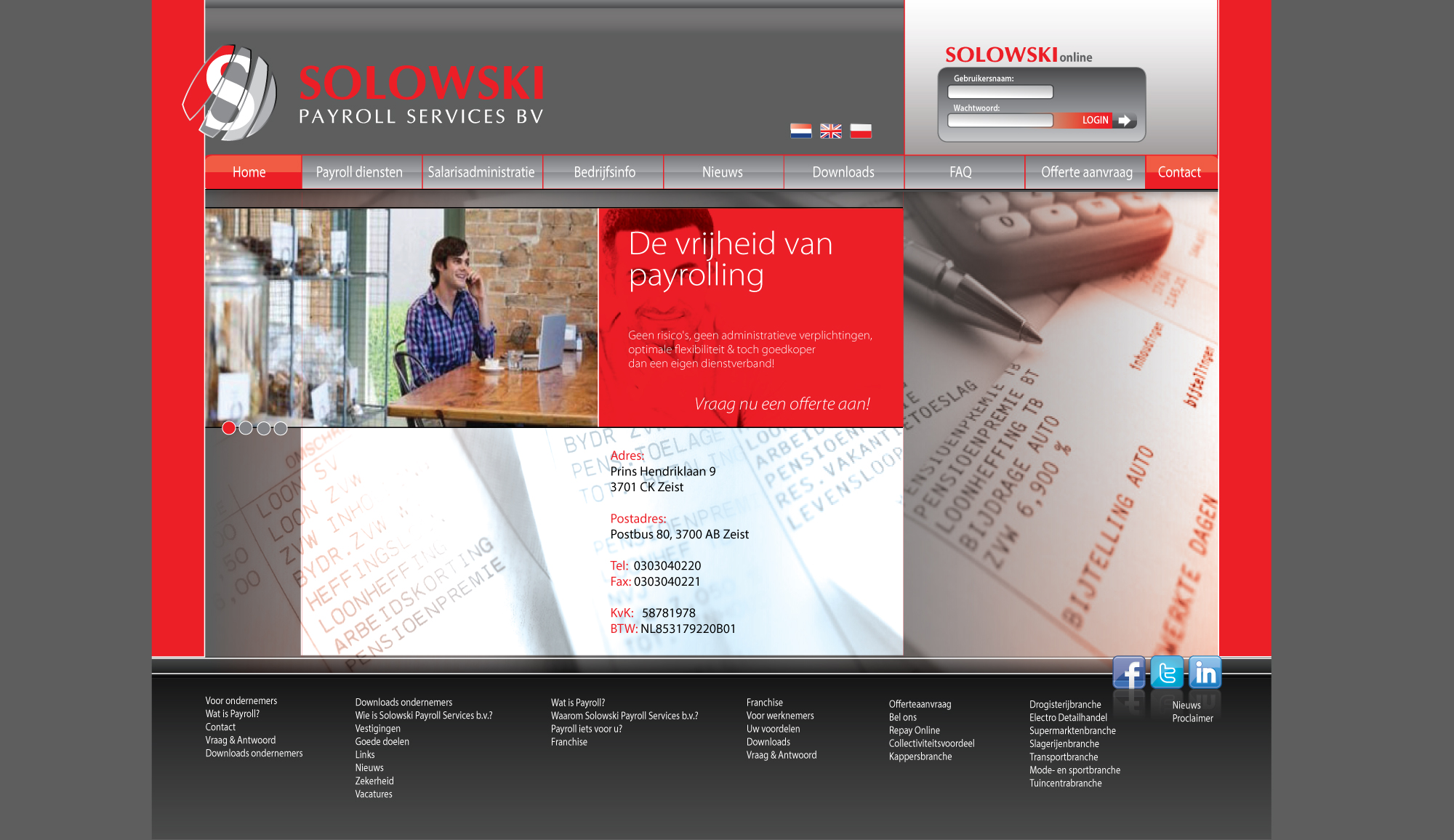
JSolowski says :
1.at the top, could you delete the icon next to "get started" button?
2.in the section "select onze diensten u zoekt" where we have the icons: could you delete the grey one?(center alignment of the rest)
3. Offerte aanfraag section- could you keep the two boxes (last name, eail adress) but under it create the bigger space (the size of those two boxes together) where people can insert also question/ details for offer request?
4. We would like to change the last section: red square with offerte anfraag, because it is too repetitive. The design is okay but the content will be different. So we would like there to be the title (as small as it is now):"Publications to download"and under it kind of hyperlinks titles of publicatyions (you can insert around 6 random titles) and under it : read more button.
5. we really like design of subpage you added and could you also do something like the link i send you but adjuste it to our subpage design that you have sent already?: https://drive.google.com/drive/folders/1C7-aTqyVzOFhaf_83yhhJHUzf64T99lL?usp=sharing
6.and please one of the criteria was examplary alignment for mobile device. Could you send me this?
If you have any further questions please contact me
-
designspixel says
sure Sir, will do the changes as requested and will update you as soon as possible.
With Regards,
Designspixel -
designspixel says
Hi Sir,
Please find the below link for revised homepage and inner page designs as per your suggestions. Check and let me know your thoughts.
https://easyupload.io/mu18qs
With Regards,
Designspixel -
designspixel says
Hi Sir,
Please find the below link for revised homepage and inner page designs as per your suggestions. Check and let me know your thoughts.
https://easyupload.io/mu18qs
With Regards,
Designspixel -
This contest is finished. Its not possible to reply anymore.
-
-
-
designspixel says
Inner page design concept as requested. Please let me know your thoughts.
-
JSolowski says :
Dear designpixel,
We have few more things to adjust and as fast as you adjust it, we will select you as a winner!
1. On the subpage design example, could you keep the red box on the right but delete the white part under it (when people are supposed to insert text)? -
designspixel says
Hi Sir,
Thanks for your response and choosing as winner. Sure, will do the changes as suggested and will upload the design in any server and will show you. Thanks for your support.
With Regards,
Designspixel -
designspixel says
Hi Sir,
Hope you received my messages regarding updated designs.
Let me know if you have received or not.
With Regards,
Designspixel -
designspixel says
Hi Sir,
Please check the revised designs
https://easyupload.io/mu18qs
Let me know if you need any more changes.
With Regards,
Designspixel -
designspixel says
Hi Sir,
Please check the below link for updated design
https://easyupload.io/mu18qs
If approve the files Brandsupply will release the amount sir.
With Regards,
Designspixel -
JSolowski says :
hello; i cannot find the mobile device adjusted design. Is it in those files?
-
JSolowski says :
so mobile layout
-
designspixel says
I apologies sir.
Actually I forgot to upload the file. So other than mobile version all other changes were perfect right ? I will upload mobile version now.
With Regards,
Designspixel -
designspixel says
Hi Sir,
Please check the below link for mobile view of homepage design. Let me know if your thoughts.
https://easyupload.io/shsky4
With Regards,
Designspixel -
JSolowski says :
dear Designpixel,
Few things to adjust on a mobile version:
1. The section when the pictures of workers are (under profesionele teamleden). - instead of one big picture we would like there to be small pictures of every worker with a name under it
2. and when you click on one of the pictures we would like it to lead to subpage, so can you send example of this subpage with workers - all for mobile layout
3. and subpage of 'frequently asked questions' for mobile layout
To change on normal website example:
1. At the top on the grey strip- can the names be a bit bigger? just a little bit
2. and at the top grey strip change "payrol diensten" for 'international payroll" - and also change the name under the icon from "payroll"to "International Payroll"
3. Change the name under the icon from "Jaarrekening" to "Salarisadministratie"
4. at the very bottom, under the publications to download we have white strip - please align this text to the text from black strip under it so its until the same point. -
designspixel says
Sure sir will do the changes as requested.
-
designspixel says
Hi Sir,
Please check the below link for updated homepage and mobile view layout design as you requested.
https://easyupload.io/z4m6zw
Thanks,
Designspixel -
designspixel says
Hi Sir,
Please check the below link for updated homepage and mobile view layout design as you requested.
https://easyupload.io/z4m6zw
Thanks,
Designspixel -
This contest is finished. Its not possible to reply anymore.
-
-
-
Description by designer designspixel:
Hi Solowski,
Please check the uploaded homepage design concept. Let me know your thoughts.
WIth Regards,
CD -
designspixel says
Please let me know your feedback on the design.
With Regards,
CD -
JSolowski says :
Hey designspixel! We will let you know this week what our decision is and if we have any feedback!
-
designspixel says
Thanks for your update Sir. Please let know if you need any more changes will do now.
With Regards,
designspixel -
JSolowski says :
Welcome. We have some feedback and we would ask you to adjust it.
1. The upper part (the strap)- we want it to be leveled with the whole design because it seems too short. the logo next to the strip should be equal with the layout ( until the same point as the grey frontpage) so we want it to be compatible and as long as the part "de vrijheid van payrolling"
2.at the front page there is a phone and email- it is not visible enough. please make it somehow more visible.
3. Could you give us the example of subpage? after they click for example "read more".
4. the bottom grey strip looks not compatible with the rest of the page so somehow adjust it. maybe the color or the design of it. -
JSolowski says :
sorry for sending the same message 3 times it was an error. If you have any questions regarding feedback let us know
-
designspixel says
Hi CH,
Thanks for your feedback. I will do the changes as requested and will upload by end of the day. If needed any clear info regarding changes I will get back to you.
Thanks,
Designspixel -
This contest is finished. Its not possible to reply anymore.
-