WEBSITE DESIGN SOLOWSKI PAYROLL SERVICES
Contest details:
Bronze
- Contest holder: JSolowski
- Category: Website design
- Total budget: € 499.00
- Start date : 05-02-2020 12:50
- Ending date : 19-02-2020 00:00
- Status : Ended
- Relevant files:
-
Available languages:

- Number of designs: 16
-
Response rate:
low high
Needs:
Our color palette consists of red, grey, black, white and our website should be connected to those colors. Our logo is also attached.
The website consists of following ‘’bookmarks’ :
- Homepage
-Services
-About us
-FAQ
-Offer request
-Downloads
And a tab to log in is visible.
We receive a design for both mobile and desktops so that we can use it.
The designs do not have to be in html but can be supplied as a pdf / photo shop file. The design will be implemented in a Joomla CMS.
Company description:
Target group:
Colors, favourites and other requirements
Simke
-
-
Simke says
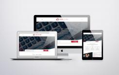
And here is how it will like on different devices.
Later on, I can code your site and make it responsive. -
JSolowski says :
Hey Simke! We will let you know this week what our decision is and if we have any feedback!
-
Simke says
Thank you Mr. Solowski! Waiting for your feedback.
-
This contest is finished. Its not possible to reply anymore.
-
-
-
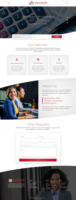
Simke says
Hello!
Here is my proposal. I hope you will like it!
Instead of complete menu, I put three spots, so when you click on it, a full screen menu opens. In this way your web page looks more clear. That's my idea but if you don't like it, I'll put classic menu. On contrary, if you like the idea, I can show you how I imagined full screen menu.
If you have any other suggestions, do not hesitate to contact me.
Please note that this is NOT a copy of some template, this is MY work!
If you want, you can check my portfolio on https://www.behance.net/vladimirsimic
I would like to have a feedback from you for my work.
Thank you! -
This contest is finished. Its not possible to reply anymore.
-