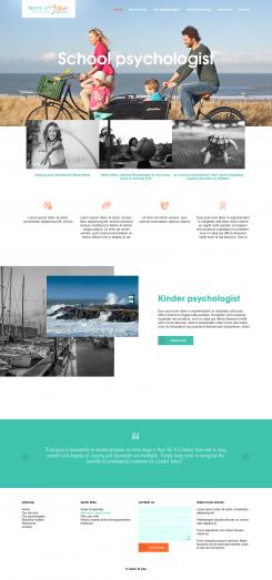
Website for a school psychologist in The Hague
Contest details:
Bronze
- Contest holder: Mieke Smet
- Category: Webpage design
- Total budget: € 399.00
- Start date : 15-08-2018 10:33
- Ending date : 22-08-2018 00:00
- Status : Ended
- Relevant files: None
-
Available languages:


- Number of designs: 9
-
Response rate:
low high
Needs:
I would like a website for my own private practice. I'm working as a school psychologist with children between the ages of 4-18 years old. The website will mainly be viewed by parents and schools. Most of my clients are part of the expat population in The Hague, hence I would like to have a website in both Dutch and English. The website should invite to get in touch with me and it will have a few functions to answer a general intake questionnaire.
I already have the text written for my website and I could forward this if needed.
Keywords for my website: calm, clear, modern
I would like to facilitate the people who visit my website to quickly find the information they need, without much "bla,bla". Personally, I'm a fan of using icons as a visual guide. I would like to see calm colours which will make my logo pop and I was thinking of using black and white beach photos/ dunes from The Hague.
Company description:
Target group:
Colors, favourites and other requirements
MickC
-
-
Description by designer MickC:
Beste,
hierbij mijn inzending.
gr, Mick -
Mieke Smet says :
Hey Mick,
Ik vind de combi tussen kleur en zwart-wit met de kleuren van mijn logo terugkomend in de kopjes erg leuk overkomen.
Mijn logo vind ik wel alleen een beetje weggemoffeld in een hoekje en de combinatie tussen het lettertype van mijn logo en het lettertype van de headings vind ik ook niet geheel bij elkaar passen. Zou je dit misschien aan kunnen passen?
Vriendelijke groet,
Mieke -
MickC says
dank voor de feedback ik zal dit aanpassen
gr, Mick -
This contest is finished. Its not possible to reply anymore.
-