Freshen up existing design of logo and website for female IT freelancer
Contest details:
Bronze
- Contest holder: mlmdegroot
- Category: Webpage design
- Total budget: € 299.00
- Start date : 25-03-2013 16:33
- Ending date : 08-04-2013 16:30
- Status : Ended
- Required formats: jpg,psd,ai,
- Relevant files: None
-
Available languages:

- Number of designs: 18
-
Response rate:
low high
Needs:
Company description:
Pick my Brain specializes in designing software on a functional level, for offshore development. Because programmers and clients are in a different country, the demand for clear software specifications is even stronger. Furthermore, attention to the communication is important, because of differences in location, time and culture. Pick my Brain discusses with the client what his ideas are, translates these into clear software specifications for the programmer and makes sure the programmer thoroughly understands what is needed. On delivery the client is trained in using the delivered software or website.
Target group:
My direct clients are usually software companies with developers abroad. It could also be design agencies that outsource web development, or end clients.
Colors, favourites and other requirements
(See attached files and current website: www.pickmybrain.eu)
Logo and style:
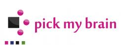
I'd like to keep the color pink (#C91F82), the font used for the name (Moolboran) and the idea of the arrow (connecting the parties involved to move forward together), although the arrow design can be a bit different. I like the combination of pink with dark grey (e.g. #1A1A1A), and currently used secondary colors are blue (#1B1389) and green (#578E23). These can be changed. I like a feminine touch, but it has to give a professional impression. I like the concept of a pattern with the logo (see business card), but the current one is a bit too cheerful to use on bigger surfaces. To add some organic shapes, I would like to do something with the China blossom.
Website:
The website currently has the layout of the Functional Design documents that I make: Large image area on the left, explanation on the right, with letters indicating what the explanation is about. I like the setup, but it's not perfect yet. The footer could be more involved in the design.
Frankieey
-
-
Description by designer Frankieey:
Ideetje 2
-
This contest is finished. Its not possible to reply anymore.
-
-
-
Description by designer Frankieey:
Ideetje 1
-
This contest is finished. Its not possible to reply anymore.
-
-
-
mlmdegroot says :
Dank voor de update weer. Goed meegekeken met mijn opmerkingen over de andere designs, over de alternerende kleuren. Ik zie nu wel dat het met dit logo iets te veel zwart-roze-zwart-roze wordt. Ook mis ik nog de eenheid van het logo en de naam.
-
This contest is finished. Its not possible to reply anymore.
-
-
-
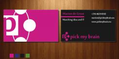
Description by designer Frankieey:
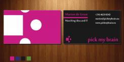
En een verbeterde versie van het visitekaartje.
-
This contest is finished. Its not possible to reply anymore.
-
-
-
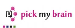
Description by designer Frankieey:
Hier een verbeterde versie van het logo. Ik heb nu een verbinding gemaakt. Dit natuurlijk omdat dit een betekenis van uw bedrijf voorstelt.
Feedback is van harte welkom. -
mlmdegroot says :
Dank voor de update. Die cirkel geeft al veel meer verbinding, evenals de P in het vierkant. Wel worden die roze bolletjes mede door het glansje een soort plastic kraaltjes. Iets te poppig, frivool.
Groeten,
Marion -
This contest is finished. Its not possible to reply anymore.
-
-
-
Description by designer Frankieey:
Hierbij ook een ideetje voor het visitekaartje. De website komt later pas.
-
This contest is finished. Its not possible to reply anymore.
-
-
-
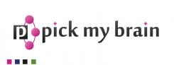
Description by designer Frankieey:
Mijn eerste ontwerp voor het logo.
Uitleg over het logo,
Het grijze vierkant staat voor uw bedrijf. Die te maken heeft met verschillende bedrijven (de roze rontjes) en deze in een pijl vooruit brengt.
Feedback is van harte welkom -
mlmdegroot says :
Dank voor je ontwerp! Ik vind de roze lijn tussen de naam en functietitel mooi, en de indeling van de voorkant van het visitekaartje. Het vierkant en de rondjes zijn niet echt een eenheid. Ook zou ik het mooi vinden als het logo en de naam meer een eenheid zijn als ze bij elkaar staan. Wel mooi om het logo groot achterop het visitekaartje te doen, maar misschien dat toch de uitleg wat ik doe er op moet (nog niet over uit).
-
This contest is finished. Its not possible to reply anymore.
-