New grafic design homepage www.rentair.be
Contest details:
Silver
- Contest holder: Rentair
- Category: Webpage design
- Total budget: € 499.00
- Start date : 01-04-2014 17:45
- Ending date : 17-04-2014 17:42
- Status : Ended
- Required formats: jpg,psd,ai,
- Relevant files: None
-
Available languages:


- Number of designs: 29
-
Response rate:
low high
Needs:
1. Functional and visually oriented
2. Icons for "drogen", "verwarming" (5) etc on the website www.rentair.be must be used, size could be varied (see attachments for example)
3. Call to action for webshop
4. Call to action for online chat, call me, email me and contact form
5. Online brochure button, search per product section, search for usage
section.
6. Creative design for project references/testimonials section
7. Use www.ictrent as a base for the design..I like this design but would
like to see improvements.
8. Less is more, so please work on an intuitive and functional design
using images.
9. Visible "Why Rentair" section with bulletpoint presentation of USP's
10. LOGO text changed to "Master your climate"
Company description:
Rental business. Company rents out equipment for air quality control such as air conditioners, coolers, heaters, humidifyers, dryers to Belgium customers.
Target group:
Target market segments are: construction companies, industry with climate control issues. Owners of shops, server rooms, organizers of events, office buildings. Construction site operators.
Colors, favourites and other requirements
Improve the design of the homepages of www.ictrent.nl and www.boels.be using creative ideas to incorporate the requirements.
Use the 5 icons for the 5 product ranges (see attachments)
marioline
-
-
marioline says
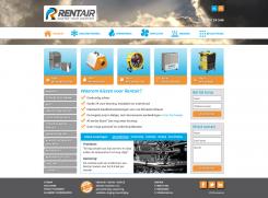
Bij deze versie is het de bedoeling dat de achtergrond foto van de header "fixed" is, zodat je wanneer je scrolt het lijkt of de menubalk, logo etc er "los" van zijn (weet niet of dit een goede uitleg is, 't is maar een idee).
Ik hoor 't graag als je aan kunt geven welke kant ik op zou moeten met de stijl van de buttons en het linker menu (en overige op- en aanmerkingen).
mvg,
Marioline -
This contest is finished. Its not possible to reply anymore.
-
-
-
marioline says
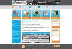
Beste Frans,
Bedankt voor de uitgebreide feedback.
In mijn nieuwe ontwerp heb ik de layout aangehouden, maar geprobeerd meer "style" toe te voegen.
Voor wat betreft de klant referenties, dacht ik dat het een goed idee was om ook de oplossingen te tonen. Om niet in een lange lap tekst te verzenden heb ik nu 1 probleem + oplossing in een soort slider opgenomen (uiteraard is de bedoeling om per onderdeel een passende achtergrond foto te tonen).
Graag hoor ik wat je van dit nieuwe ontwerp vindt en wat je nog voor wijzigingen zou willen zien.
mvg,
Marioline -
This contest is finished. Its not possible to reply anymore.
-
-
-
Rentair says :
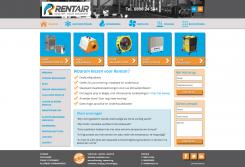
Dear Mariolinem I like the placement of the different items on the homepage and the visualization of the call to action buttons. However, for some reason I think this design is too simplistic, i.e. somewhat "childish". Please try to come up with a new design, but do not change the layout, which I really like. Try to bring in a more "professional" look for comparison. What would happen if you modify the call to action design, not in terms of colour but more the pure design?. Second remark: the items on the left side are somewhat "invisible" and do not catch the eye, pls try to modify these so they are more visible in terms of colour or design....Third remark..I really need to see the references more clearly...they need to catch the eye as well. Thanks for your new design. Your design is one of the three top contenders at the moment.
Frans -
This contest is finished. Its not possible to reply anymore.
-