New corporate identity for a tax advisory firm
Contest details:
Bronze
- Contest holder: Belastingadvieskantoor
- Category: Stationery design
- Total budget: € 229.00
- Start date : 16-07-2015 16:07
- Ending date : 27-07-2015 16:00
- Status : Ended
- Required formats: jpg,ai,pdf
- Relevant files: None
-
Available languages:


- Number of designs: 48
-
Response rate:
low high
Needs:
English translation:
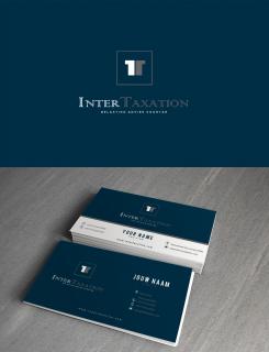
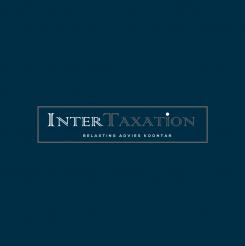
InterTaxation is a new incorporated tax advisory firm in need of a simple and easily recognisable corporate identity. We have a wide range of clients, large international companies as well as small SME`s. We hope for a restful and professional business look. Our logo should have at least 1 color but preferably two (or more). The business cards should have a Dutch and English side.
Company description:
Target group:
Colors, favourites and other requirements
LPL
-
-
No comments
-
This contest is finished. Its not possible to reply anymore.
-
-
-
No comments
-
This contest is finished. Its not possible to reply anymore.
-
-
-
No comments
-
This contest is finished. Its not possible to reply anymore.
-
-
-
LPL says
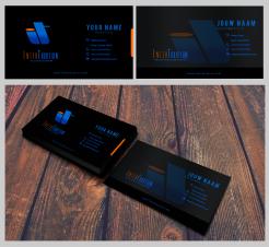
Hi, Sir,i thought about what you said that most of the business cards there are mostly in white background. I thought ,sometimes,in order to be remembered we have to deviate from the norms. Black somehow will represent formality.This is only my opinion , sir.
-
LPL says
Would you want this to be in white background, sir?:)
-
This contest is finished. Its not possible to reply anymore.
-
-
-
LPL says
I thought you might want to see the logo on a different color background. I also amend the font for InterTaxation. Should there be anything that you want sir, please let me know.
-
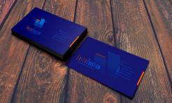
Belastingadvieskantoor says :
Blue on blue doesnt work for us. Most business cards have a white background in our (business) culture.
-
LPL says
ok, sir, i will do a white version also.
-
This contest is finished. Its not possible to reply anymore.
-
-
-
LPL says
Good day, Sir, the words in Dutch and in English are interchangeable with the design.
-
This contest is finished. Its not possible to reply anymore.
-
-
-
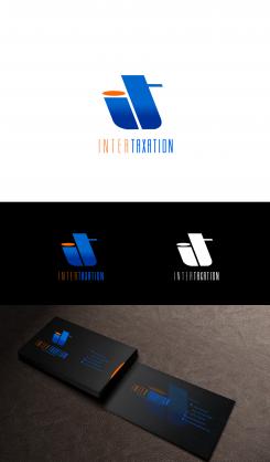
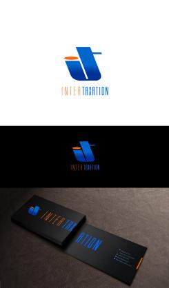
LPL says
Hi, Sir, do you have any specific color that you like? this logo is flexible in color.
-
Belastingadvieskantoor says :
We do like mutiple shades of blue. The design of the card is very nice but how can we adjust it in way that we can present a business card which is in English on one site and in Dutch on the other?
-
LPL says
What specific words would you like to be written at the back of the card, sir?
-
LPL says
i mean the words in Dutch
-
Belastingadvieskantoor says :
Both sides we be the same but one will be written in English , the other (with the same information) in Dutch. This way we can have 1 business card and it doesnt matter if we hand it out to Dutch clients or international clients.
-
Belastingadvieskantoor says :
Although we like the logo design we are of the opinion that the letters "it" are so linked to "information technology" that we prefer another kind of logo. But we hav to say that it is done in a very nice way (one of the best so far)
-
LPL says
Ok, sir, thank you for the feedback, it will help me create the way you like it.
-
This contest is finished. Its not possible to reply anymore.
-