Design the new van for a sustainable energy company
Contest details:
Gold


Needs:
Things we like are for example:
- An individual van design/color for each of our services (solar panels, heat pumps, green roofs, etc.)
- Natural or playful shapes and illustrations. We've included a few with the files, but feel free to play around with them or add to them. You absolutely don't have to use them.
- A striking color (green?)
You will find our corporate identity colors and logos at groenpand.nl/stijlgids. Do you need more/other files or do you have a question about this competition, our marketing guru Esther is happy to help you: marketing@groenpand.nl
To make it easy for you, we have made a mock-up available in which you can make your design. You can open it with Adobe Photoshop:
greenpand.nl/belettering-mockup
If you're the winner, we'd like to give you the opportunity to create designs for our other company cars, for a reasonable fee. And perhaps you have some fabulous ideas for our company building? Not required, but we think it's a great opportunity?!
Company description:
Groenpand is a young idealistic company from the Netherlands specialized in the installment of solar panels, heat pumps, green roofs and other energy saving opportunities. We are also a supplier of clean, green energy. Our mission is the make homes and offices independent of polluting fossil fuels. Will you take a look at our website? www.groenpand.nl
Target group:
People like us who consciously choose sustainability over the alternatives.
Colors, favourites and other requirements
- Our logo (see relevant files)
- The slogan 'Maak je pand planetproof'
- Our brand colors (groenpand.nl/stijlgids)
dadan
-
-
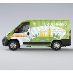
Groenpand says :
We liked the version without the green top better. Sometimes less is more!
-
This contest is finished. Its not possible to reply anymore.
-
-
-
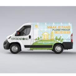
Groenpand says :
Not a big fan of the hand, sorry.
-
This contest is finished. Its not possible to reply anymore.
-
-
-
Groenpand says :
Better, thank you! :)
-
This contest is finished. Its not possible to reply anymore.
-
-
-
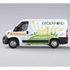
Groenpand says :
De blauwe lucht is absoluut beter. De lettergrootte en kleur van 'planetproof' en 'groenpand' zit wat te dicht bij elkaar, waardoor het onduidelijk is welk woord het logo is.
The blue sky is definitely better. The font size and color of 'planetproof' and 'groenpand' is a little too similar, making it unclear which word is the logo. -
This contest is finished. Its not possible to reply anymore.
-
-
-
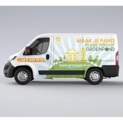
Groenpand says :
Het idee van de kleine planeet met een groenpand huisje erop is leuk! Het gebruik van de kleur lichtblauw is ook een aangename verrassing. We zijn echter niet zo'n fan van het gebruik van het bladhuisje als patroon hiervoor. Het logo komt waarschijnlijk ook beter tot zijn recht als het een centralere plek inneemt op de zijkant.
The idea of a small planet with a groenpand house on it is nice! The use of the light blue color is also a pleasant surprise. We're not a big fan of the use of the leaf-shaped house as a pattern though. The logo would probably be better placed in a more central position on the side. -
This contest is finished. Its not possible to reply anymore.
-