 Nederland
 België
 France
 Deutschland
 Österreich
 United Kingdom
Toelichting op mijn logo-ontwerp: ik heb de vrijheid genomen om 'My SafeHouse' in Myriad Pro, oranje en zwart, te interpreteren. Weet natuurlijk niet hoe dit er eigenlijk uitziet, maar het sprak me aan om het toch te verwerken, dus ik hoop dat dit niet te veel afwijkt en/of irriteert. Uitleg: het stabiele van een huis, je STAAT als een huis, de rust en flexibiliteit wilde ik weergeven: het dak is uiteraard van het huis, de schuine 'wanden' staan voor introperspectie, het in jezelf tot rust komen (ademhaling), om zo tot stabiliteit te komen. Het evenwicht komt terug zowel in de schuine 'wanden' als in de dwarse lat op het dak. Mijn intentie is: helderheid, flexibiliteit, evenwicht, veiligheid door zelfvertrouwen, of: 'jezelf kunnen vertrouwen'. Lila heb ik gekozen, omdat het contrastreert met het oranje maar tegelijkertijd ook samengaat, doordat beide een zweem van rood in zich hebben. Oftewel: een tegenstelling en tegelijktijd een mate van gelijkheid, de verschillende delen komen samen tot één, zonder hun individualiteit te verliezen. Lila staat voor spiritualiteit, in zichzelf keren (teneinde zichzelf te leren kennen), en intuïtie.
Design a symbol/emblem
- Contest holder: MySafeHouse
- Category: Other
- Status: Ended
Start date: 29-05-2012
Ending date: 20-06-2012
It all started with an idea...
A short, interactive guide helped them discover their design style and clearly captured what they needed.
Brandsupply is a platform where creative professionals and businesses collaborate on unique projects and designs.
Clients looking for a new logo or brand identity describe what they need. Designers can then participate in the project via Brandsupply by submitting one or more designs. In the end, the client chooses the design they like best.
Costs vary depending on the type of project — from €169 for a business or project name to €539 for a complete website. The client decides how much they want to pay for the entire project.
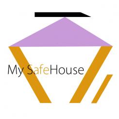
Hallo, bedankt voor uw inzending en uitgebreide uitleg. De 'constructie' van het huis spreekt mij aan; Je uitleg is mooi en doordacht, bedankt daarvoor. Ik 'mis' de vijf elementen die onderling met elkaar verbonden zijn en de 2e schuine streep naast het huis kan ik niet plaatsen. Aan lila moet ik wennen. Uiteraard wacht ik ook meerdere inzendingen af.
MvrGr. Raymond
Beste Raymond, bedankt voor je reactie. Ik zie 'de lucht', 'het luchtledige', hier weergegeven door het wit, als de 'verbindende factor'. De tweede oranje streep geeft voor mij beweging en daarmee ook flexibiliteit weer. Deze beweging is voor mij ook een verbindingspunt tussen alle elementen. Ook is dit een visuele tegenhanger van de tekst: die geeft aan de linkerkant iets meer 'gewicht'. Ik begreep dat het logo ook op zwart te gebruiken moet zijn, de balacerende zwarte balk op het dak kan op een zwarte achtergrond wit worden.
Ik vond het fijn een duidelijke reactie te krijgen, niet alle opdrachtgevers geven feedback. :-)