New CBD Eliquide Brand
Contest details:
Silver
- Contest holder: Francoisjdc
- Category: Logo & stationery
- Total budget: € 419.00
- Start date : 19-12-2017 18:01
- Ending date : 18-01-2018 00:00
- Status : Ended
- Required formats: jpg,ai,pdf
- Relevant files: None
-
Available languages:

- Number of designs: 111
-
Response rate:
low high
Needs:
Product description : 100% natural CBD based E-liquide with indoor cannabis terpenes
The brand name is : Natural
The logo should communicate Swiss quality and additive free product and make future client want to try.
Thanks in advance for your sketchs.
Francois
Company description:
Target group:
Colors, favourites and other requirements
aldila.m
-
-
Description by designer aldila.m:
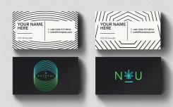
This is how the business card look.
-
This contest is finished. Its not possible to reply anymore.
-
-
-
Description by designer aldila.m:
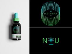
This logo is designed with geometric circular shapes which form a circular sound wave as its main element. Circular sound wave represent receptors’ active resonance in brain neurons. At a glance, the circular also form a tunnel-like shape which can be interpreted as a tunnel where substance is carried to the brain.
The circular also can be seen as an eye with Natural’s typography in it. The eye symbolize universal mind and indicate that CBD does not make your eyes weary the way THC does.
I am using sans serif and minimalist font type to keep. the logo simple yet modern and timeless to keep future client interested.
A cannabis with seven leaf shape represents the perfectness and quality of the raw material Natural is using. It is also a substantial element which show the main element of this e-liquid product. The underline beneath the cannabis leaf is meant to be interpreted that this e-liquid product is harmless and additive free.
Not only the logo type, I also designed a logogram consists of Natural’s acronym. The logogram is designed in N & U taken from Natural, with a hint of underline in between. The logogram can be read as “Nu” which means fresh/up to date/modernistic.
The dominant color I am using is lime green which can be interpreted as natural and growth, and light blue which can be interpreted as sky, trust and wisdom. Color placement is also arranged in earth order: Blue above, green below. Black is used as a background to emphasize the logo and as a symbol of elegancy.
With all element that have been designed, the logo now has an elegant and sexy look with a hint of psychedelia twist. -
This contest is finished. Its not possible to reply anymore.
-


