No comments
Logo & stationary for a new RECRUITMENT firm for NAVAL ENGINEERING based in AMSTERDAM
- Contest holder: dsawa
- Category: Logo & stationery
- Status: Ended
- Files: File 1, File 2, File 3
Start date: 01-02-2018
Ending date: 08-02-2018
It all started with an idea...
A short, interactive guide helped them discover their design style and clearly captured what they needed.
Brandsupply is a platform where creative professionals and businesses collaborate on unique projects and designs.
Clients looking for a new logo or brand identity describe what they need. Designers can then participate in the project via Brandsupply by submitting one or more designs. In the end, the client chooses the design they like best.
Costs vary depending on the type of project — from €169 for a business or project name to €539 for a complete website. The client decides how much they want to pay for the entire project.
No comments
Hi,
I am glad you like my work.
I understand your recommendations. Here is another concept with a gradient of shapes representing the initials and the concept of recruitment.
Hi! Thanks, but my team still doesn't like it 100%.
The colors can also be different, if you feel like still giving it another go please feel free to show us more designs.
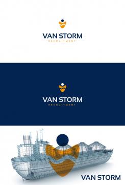
Hi,
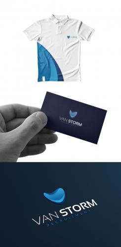
Thank you for your feedback. I understand your point about vaio even if a lot of logos are made with "wave style".
Anyway, I tried to make something with the same meaning but more distinctive. What do you think about this one?
Hi Wilko,
Thanks for the new design, it's still not what we love, but you are definitely one of the top designs we like.
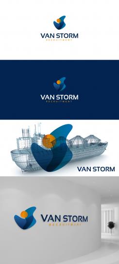
I just uploaded 2 example pictures in "relevant files", maybe something for inspiration? We would like a simple but playful and deep... it is hard to make myself clear over a written message, but I hope it clears it up a bit. Please check the added pictures, this is the style we like. About the colors, it could be different shades of blue together (or not) with orange.
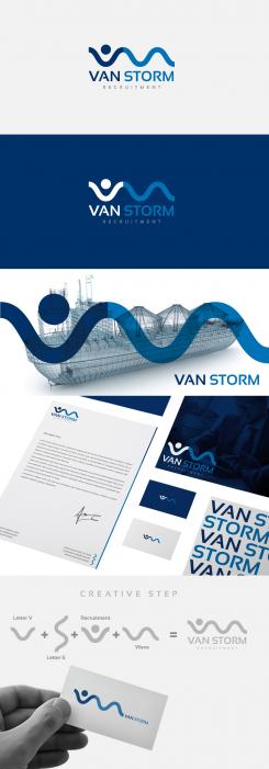
Hello,
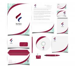
Here is my work for your new brand identity. You can see the files in good quality by clicking on the images.
I tried to bring my experience in graphic design to create a powerful and distinctive logo. I hope you will enjoy my work as much as I enjoyed working on your project.
I await your feedback and I remain at your disposal.
Best regards
WILKO
Hi Wilko!
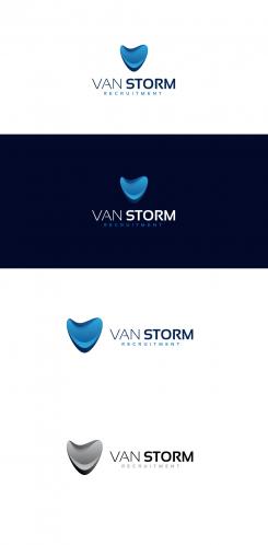
I really like the way you were thinking with the symbols, and the final effect would be great if it didn't look like Sony Vaio logo... there is too much of resemblence. Do you have any other ideas?
When it comes to colors, we would like to combine maybe the deep blue and some shade of orange to brighten it up.
 Nederland
 België
 France
 Deutschland
 Österreich
 United Kingdom
