Logo & Branding for innovative startup called QwikSense
Contest details:
Silver
- Contest holder: Rino001
- Category: Logo & stationery
- Total budget: € 349.00
- Start date : 22-01-2013 15:37
- Ending date : 22-02-2013 15:15
- Status : Ended
- Required formats: jpg,ai,pdf
- Relevant files: None
-
Available languages:


- Number of designs: 152
-
Response rate:
low high
Needs:
Get inspired by Apple and Google. Another source of inspiration is a concept design for Microsoft. see link
http://www.minimallyminimal.com/2012/7/3/the-next-microsoft.html
Can you inspire us with your design and are you ready for a challenge? We are always looking for new team members.
For additional information / questions: info@refitrealestate.nl
Company description:
QwikSense is an initiative of two young passionate entrepreneurs. QwikSense provides the Facility Manager real-time insight into the working environment for optimal and healthy indoor climate.
The QwikSense system is an integral Comfort and Energy Management System for commercial buildings. QwikSense contributes to an optimal indoor installation.
The indoor climatic conditions is determined inter alia by the temperature, air quality and the quantity of light. The result is not only an increase of the productivity, but also the optimal functioning of the installations, it can save up to 30% energy costs.
Target group:
The target group are the persons responsible for the facility management within an organization. Think of energy and comfort management.
Colors, favourites and other requirements
It must be fresh and innovative!
pabs72
-
-
pabs72 says
Rino,
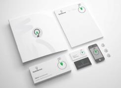
I think 'less is more' with this design, I've kept the branding simple and fun (using the logo upside down to represent the lighbulb gives the business a human side with a sense of humour). -
pabs72 says
Rino,
I think 'less is more' with this design, I've kept the branding simple and fun (using the logo upside down to represent the lighbulb gives the business a human side with a sense of humour).
-
This contest is finished. Its not possible to reply anymore.
-
-
-
pabs72 says
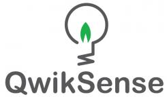
The lightbulb shape represents innovation, energy and light, it also contains a lower case 'q' and 's'. The green leaf dynamic represents environment, energy (could be a gas flame too) and growth.
-
Rino001 says :
Thanks, do you also have a proposal for a branding?
Ciao,
Rino -
This contest is finished. Its not possible to reply anymore.
-


