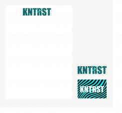
Corporate Identity and Logo design for yound and dynamic Coaching & Training's Institute in Amsterdam
Contest details:
Silver
- Contest holder: Robbiieerob
- Category: Logo & stationery
- Total budget: € 349.00
- Start date : 14-06-2013 20:32
- Ending date : 14-07-2013 20:18
- Status : Ended
- Required formats: jpg,psd,ai,pdf
- Relevant files: None
-
Available languages:


- Number of designs: 204
-
Response rate:
low high
Needs:
The style we are aiming for is young, dynamic, tight, simple and contemporary. In terms of colors, everything is still open.
KNTRST (spoken: kontrast) is a young, creative and enthusiastic Coaching and Training's Institute that (amongst other things) specializes on coaching Artists and Musicians.
KNTRST is a platform that offers everyone that wants to get the best out of themselves a chance to do so: In our opinion getting the best out of yourself is a state of mind.
Our goal is to become the most recognizable Coaching & Training's Institute within Amsterdam and the Dutch Music Industry.
Company description:
KNTRST (spoken: kontrast) is a young, creative and enthusiastic Coaching and Training's Institute that (amongst other things) specializes on coaching Artists and Musicians.
KNTRST is a platform that offers everyone that wants to get the best out of themselves a chance to do so: In our opinion getting the best out of yourself is a state of mind.
Our goal is to become the most recognizable Coaching & Training's Institute within Amsterdam and the Dutch Music Industry.
Target group:
Young professionals
Colors, favourites and other requirements
Thera
-
-
Description by designer Thera:
Hallo Rob,
Hierbij mijn bijdrage.
Ik heb gekozen voor een stevig/vet lettertype opgevuld met een contrastrijk patroon. Het patroon geeft bovendien een beweging weer. Deze beweging illustreert verbetering/verandering/groei. En daarnaast heeft deze beweging ook wel wat weg van een soundwave.
De kleuren zijn overigens gemakkelijk aan te passen. Dus mocht je graag een andere combinatie zien, dan is dit geen probleem!
Hartelijke groet,
Thera -
This contest is finished. Its not possible to reply anymore.
-

