A Great logo for a Great Radio station
Contest details:
Bronze
- Contest holder: mhegay
- Category: Logo & stationery
- Total budget: € 359.00
- Start date : 16-01-2018 18:55
- Ending date : 30-01-2018 00:00
- Status : Ended
- Relevant files: None
-
Available languages:


- Number of designs: 241
-
Response rate:
low high
Needs:
We need all your creativity.
We are a radio FM of the region Auvergne (France) with non-specialized and musical vocation. Our old logo of about twenty years needs to be totally seen again. To make you an idea of the current logo go either on the attached file, or on our website www.radioarverne.com.
Our public is a public of 30/35 y.o.to ... 77 years old!
We wish a logo using only three colors: Red, Black and White.
Fonts used will be only White andor Black.
This logo can be either in a square, or in a rectangle.
2 text versions are possible:
a/ RADIO ARVERNE 100.2
b/ ARVERNE 100.2
Last requirement: if it does not distort the logo and thus can find its place, the appearance of a wave or undulation ... (Watch out, not a Sea Wave...)!
This logo has to allow to adapt itself to various supports(media) such as: web site, social networks, flyers, commercial brochures, business(calling) cards, banners etc....
A sober but modern logo (no longer a radio drawing like the old one...) is your mission!
Good luck and we are looking forward to discovering your creativity
Company description:
Target group:
Code RED :
CMJN : 6-91-89-1
#da3229
Colors, favourites and other requirements
To be a little bit more precise, you can download the file "danslestylede" ( in the style of ) to see what kind of logo we would like. If any question, don't hesitate.
Cedric B
-
-
Description by designer Cedric B:
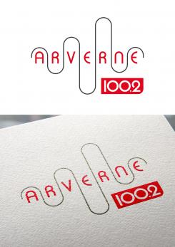
Bonjour, voici le projet avec des majuscules et une onde moins présente.
-
mhegay says :
un essai avec ARVERNE en bold?
-
mhegay says :
La nuit portant souvent conseil (ou réflexion ?) : et si on inversait le tout ? Je m'explique : le rectangle rouge 100.2 deviendrait rectangle rouge ARVERNE et passerait au-dessus et inversement l'onde du dessus passe en-dessous, entourant les numéros de 100.2
-
This contest is finished. Its not possible to reply anymore.
-
-
-
Description by designer Cedric B:
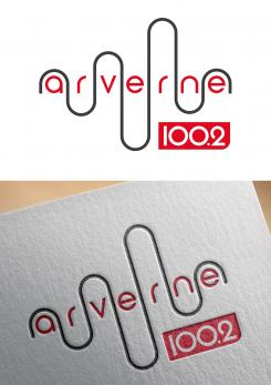
Cordialement,
-
mhegay says :
L'idée est attrayante... Par contre je trouve que les minuscules ne font pas ressortir ARVERNE et que l'onde s'impose un peu trop. Mais l'idée me séduit.
-
This contest is finished. Its not possible to reply anymore.
-


