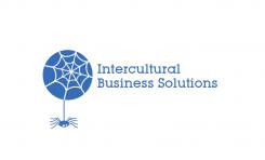
Young intercultural company looking for it's logo
Contest details:
Silver
- Contest holder: M.Violin
- Category: Logo design
- Total budget: € 329.00
- Start date : 23-06-2015 00:15
- Ending date : 11-07-2015 00:08
- Status : Ended
- Required formats: jpg,ai,pdf
- Relevant files: None
-
Available languages:


- Number of designs: 104
-
Response rate:
low high
Needs:
Company description:
Our company has been founded in February 2015 and deals predominantly in anything that pertains to intercultural business, from consultancy to assistance and facilitaion. We provide tailor made solutions to businesses as well as private individuals in any sector where this may be required through our extensive network.
Target group:
Our main target concerns businesses that do inter(national/cultural) business. predominantly in Europe our network extends worldwide. Furthermore, we are in the business of aiding expats, to immigrate and emigrate from A to B, wherever that may be, and assist them with any challenges they may encounter.
Our services comprehend but are not limited to (inter ntaional/cultural): Finance, Logistics, Legal, Recruitment and Selection, Property Management, Administration etc.
Colors, favourites and other requirements
We are looking for a unique, simple and elegant logo that expresses our know how.
During a brainstorming session we have come up with the idea of a spider juxtaposed on the world, covered by it's web.
The symbolism behind it was the company as dominating the web, to emphasize our know-how.
The web would symbolize the nodes and contactpoints we provide and handle.
The world would stand for multiculturalism.
We had trouble relating this to what ultimately is more important : the elegant and simple prerequisite. Furthermore it is absolutely not desireable that the logo can be mixed up with something else (ie : spiders very easily related to spiderman)
We were personally thinking of 2 colors : silver/chrome and blue to emphasize our trustworthiness.
We have attached several googled pictures to give an idea of what may be incorporated in the above mentioned logo.
Then again, we are open to completely different suggestions, the most important thing to us is that it is a unique, simple and elegant logo that oozes professionalism.
logoman
-
-
M.Violin says :
Hello A,
Thank you for your new submission !
To be honest, a lot of people really like this, we are sorry to say however that the current design is not what we are looking for.
This design is very cute, and we are aiming for a more elegant appearance.
We like the idea of it being one color and we think that your solution of putting the text in bold will make the company name more legible even in small iterations.
One interesting omission is the absence of an intercultural element. As the sphere that was "the planet" in your previous submissions now seems to be "just" a circle. This is not a deal breaker by any means just something that we noticed and found mention worthy.
Again, we really like the design but it is not for our intents and purposes.
Thanks again !
M. -
This contest is finished. Its not possible to reply anymore.
-
-
-
logoman says
Hello,
thanks for your feedback.
There is only one ribbon left, and it is less large than before.
I think we should keep this idea with the ribbon which describes well your activity immigration/emigration from A to B.
Please let me know what your thoughts are.
Best,
A -
M.Violin says :
Dear A.
Thanks for your kind reply and new submission!
The new logo is a big improvement over the first.
We agree with you that the ribbon is a good indication for our immigration and emigration activity however we do so much more and would therefore not emphasize on a particular activity on our logo. I think the overall design would be best served by removing the ribbon(s) altogether.
We think that the emphasis should rather be put on interculturality so the sphere is one way to do that but in the current form we would like to see a little more in that regard.
Please note that the logo will be printed in different sizes and that it is important that the company name can still be read in it's smaller forms. We do enjoy the typography and the way it is presented.
Please do not hesitate to ask if you have questions or comments.
Best,
M. -
This contest is finished. Its not possible to reply anymore.
-
-
-
M.Violin says :
Hey Logoman,
Thank you so much for participating in our competition.
The idea of "ribbons" envelopping a sphere is nice. We feel that it has the potential to convey the message that we are aiming for. We do feel however that the ribbons on the current design may be a tad prominent, read large.
Maybe it would be more elegant if the ribbons were thinner and more transparent (maybe just a line) for one and maybe less dark underneath. Given that the logo will feature in all sizes on different types of documentation, we are under the impression that the dark underlying of the ribbon might make the logo like as if it has lumps.
The question has also been asked whether it is possible to readjust the positioning of the ribbons in such a way that : 1 the "arrow" points upwards, the impression we got is that it looks as if it points downward.
2 something about the ribbons be it the positioning, the width is offputting. Maybe readjusting their size will help or readjusting how they envelop the sphere...
Even though we market to businesses and private individuals, we do aim for a corporate looking logo and general consensus was the name above the sphere in this representation feels too playful.
Perhaps it would look better if the letters are black? or otherwise represented entirely differently.
We are very much looking forward to a new submission. Do not hesitate to contact us for questions and comments !
All the best,
M.
-
This contest is finished. Its not possible to reply anymore.
-


