Young intercultural company looking for it's logo
Contest details:
Silver
- Contest holder: M.Violin
- Category: Logo design
- Total budget: € 329.00
- Start date : 23-06-2015 00:15
- Ending date : 11-07-2015 00:08
- Status : Ended
- Required formats: jpg,ai,pdf
- Relevant files: None
-
Available languages:


- Number of designs: 104
-
Response rate:
low high
Needs:
Company description:
Our company has been founded in February 2015 and deals predominantly in anything that pertains to intercultural business, from consultancy to assistance and facilitaion. We provide tailor made solutions to businesses as well as private individuals in any sector where this may be required through our extensive network.
Target group:
Our main target concerns businesses that do inter(national/cultural) business. predominantly in Europe our network extends worldwide. Furthermore, we are in the business of aiding expats, to immigrate and emigrate from A to B, wherever that may be, and assist them with any challenges they may encounter.
Our services comprehend but are not limited to (inter ntaional/cultural): Finance, Logistics, Legal, Recruitment and Selection, Property Management, Administration etc.
Colors, favourites and other requirements
We are looking for a unique, simple and elegant logo that expresses our know how.
During a brainstorming session we have come up with the idea of a spider juxtaposed on the world, covered by it's web.
The symbolism behind it was the company as dominating the web, to emphasize our know-how.
The web would symbolize the nodes and contactpoints we provide and handle.
The world would stand for multiculturalism.
We had trouble relating this to what ultimately is more important : the elegant and simple prerequisite. Furthermore it is absolutely not desireable that the logo can be mixed up with something else (ie : spiders very easily related to spiderman)
We were personally thinking of 2 colors : silver/chrome and blue to emphasize our trustworthiness.
We have attached several googled pictures to give an idea of what may be incorporated in the above mentioned logo.
Then again, we are open to completely different suggestions, the most important thing to us is that it is a unique, simple and elegant logo that oozes professionalism.
mot
-
-
mot says
Dear M,
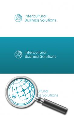
the spider has shrunk! and is now sitting amidst the nodes on the grid. Its appearance has slightly been altered, in accordance with its new position and size. I hope the design pleases you! Best, mot -
M.Violin says :
Dear Mot,
We love it !
Please do not change this design as it is currently number one in our polls, still 16 days to go!
If you are inspired, we would love to see other submissions from you.
Thank you very much.
M. -
This contest is finished. Its not possible to reply anymore.
-
-
-
mot says
Good day,
the idea of using the spider appeals to me (and surely, this makes for a distinctive logo). First, I have tried putting it on top of the globe, but that didn't work very well, it looked like the spider was about to eat or attack the world. As you can see, it's now placed slightly beneath and aside of the globe. That makes it look like it's carrying or pushing the world, or holding it gently - a much more accurate and sympathetic image :-)
The logo looks shiny because of the subtle curved lines, but in fact consists of only one colour. This makes it easy to print, and use on any background.
I'm looking forward to hear your feedback, with kind regards, mot -
M.Violin says :
Dear Mot,
We are very pleased with your submission and are impressed by the fact that you are the first to choose to tackle the spider request in your design ! We really commend you for it.
We are very fond of the overall design that you presented to us, The aesthetics of the globe and the web are very well done in our opinion and reflect a depiction of the vision we have. we like the way you incorporated our business name : simple and to the point.
Having said that, the spider as it is currently depicted strikes a dissonating tone with the rest of the design : It seems to bring it off balance. We really much appreciate your input on how to circumvent the difficulty's surrounding the aggressive image of the spider.
Your design and it's - apparent - simplicity did inspire us the following idea : what if the spider was one of the little dots on the grid?
In the service industry, as you may know, high quality is defined in the details. Therefore, the spider could be a detail within the design of the globe, not bigger than the biggest dot of the current design for example. People do not necessarily need to know it's there at first glance,or even at second glance, what is more important is that it is in fact there and that it tells the company's story.
That way it does not offset the balance of the overall look and balance of your design.
What do you think about our suggestion mot?
We like the chosen color blue and the fact that the whole design consists of just that color. We are curious as to what your design might look like with a blue sphere and black or silver text? Would you be willing to provide a visual for that in your next submission?
Congratulations again on your post and we are hopeful that we will see more from you soon.
Best,
M.
-
M.Violin says :
Dear Mot,
It has been suggested that the spider would be the dot where the current spider's leg is on the globe.
Best of inspirations too you !
M. -
This contest is finished. Its not possible to reply anymore.
-


