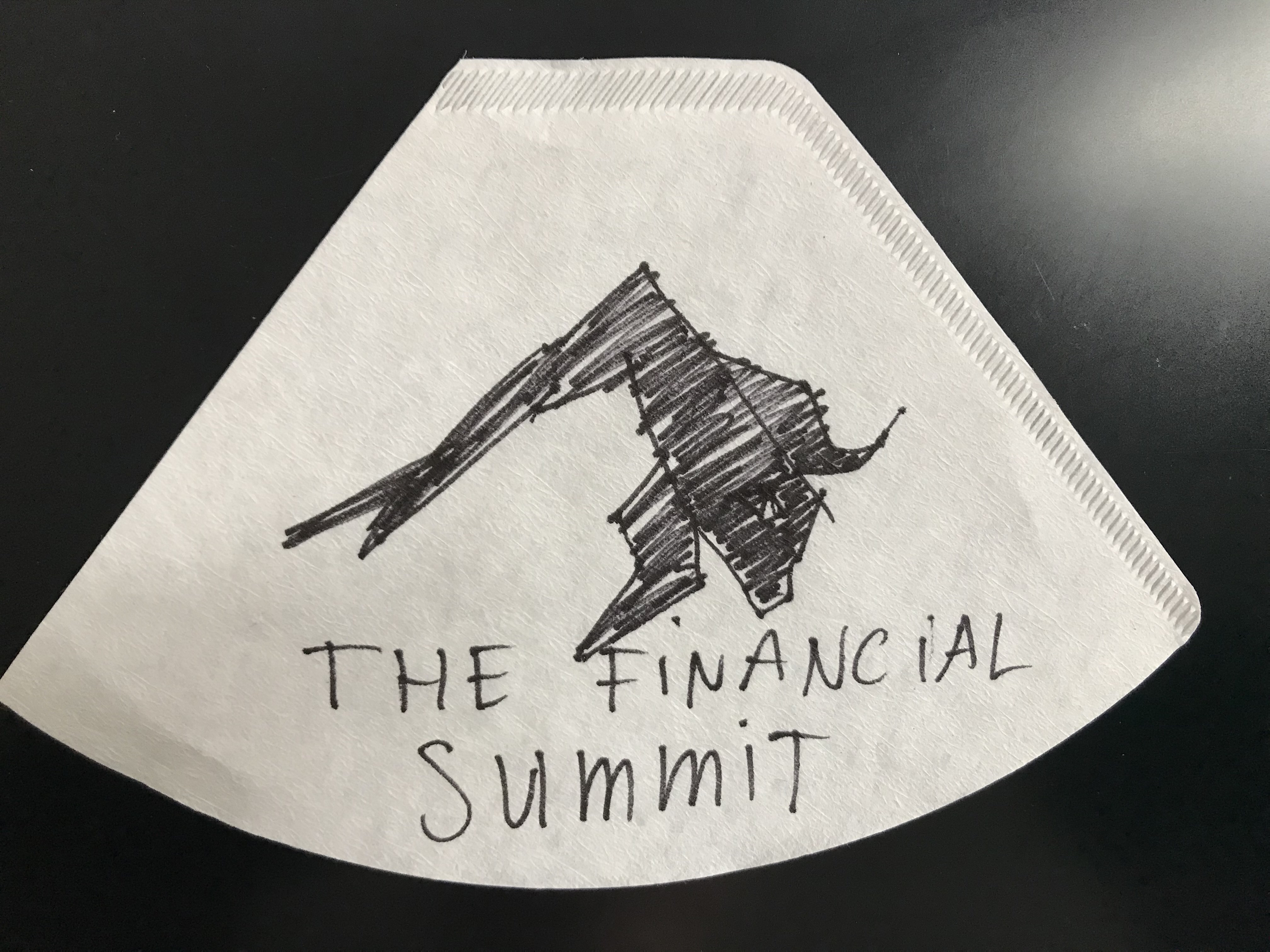
The Financial Summit logo with Summit and Bull
Contest details:
Silver
- Contest holder: TFS
- Category: Logo design
- Total budget: € 329.00
- Start date : 03-04-2020 15:05
- Ending date : 11-05-2020 08:05
- Status : Ended
- Relevant files:
-
Available languages:

- Number of designs: 321
-
Response rate:
low high
Needs:
The Summit that we want to see back in the logo refers to the name 'The Financial Summit'. The text is not too important for now, more the logo/ but if you want to place text, please do it below the logo. I have made a Pinterest board with some images that might inspire and also see the attached drawing that I upload, as an input, please copy, paste the below, you might need to prefix with https://
nl.pinterest.com/daizers1143/the-financial-summit-logo
It would be nice if we can let the mountain 'become' the bull in the design. The bull faces the right. The bull attacks, is moving forward, 'has energy', horn(s) pointed in to a moving forward direction.
The mountain starts at the left, and at a point goes into being the bull. in an abstract way. It should be stylized and simple, not too complicated. The 'coffee filter' drawing is very quickly done by a friend, but does have simpleness in it and I do see a Summit and a Bull in it. Only, this is not a designer, so this can be done way better and with the input from your design knowledge can be made into a nice logo.
Also see in the Pinterest board how I added some sketches of mountains, and some different Bull images. The logo should be only black and white and possibly black-gradient, but keep it male and strong. also not sure, but it might be good to show the 'eye' of the bull, for reference. But if the horn and the leg already show enough, that might not be needed. Till now our idea is that the bull might need an 'eye' in the design, but subtle and nice an graphical. Also you can play with the horn, the shape, mayeb it's two horns? The coffee filter drawing is just fast input, so please design also with your own input.
Company description:
The Financial Summit
A Summit (event) for high-net-worth individuals, taking place at a luxurious resort. Target group is high-net-worth, male, financial industrials, traders, hedge funds, investors
Target group:
Target group is high-net-worth, male, financial industrials, traders, hedge funds, investors.
Colors, favourites and other requirements
The logo should be only black and white and maybe black-gradient, but keep it male and strong.
krisi
-
-
krisi says
Like that?
-
This contest is finished. Its not possible to reply anymore.
-
-
-
krisi says
Hello,
here one more version where the bulls head look more straight and not down.
Let me know if I can be more helpful.
Reagrds,
Krisi -
TFS says :
Hi, can you make the bulls head more tilted up and also the horns more up. So the horns actually spike out of the straight edge?
-
This contest is finished. Its not possible to reply anymore.
-
-
-
krisi says
Hello,
here my new version of your logo.
Let me know what do you think.
Regards,
Krisi -
This contest is finished. Its not possible to reply anymore.
-
-
-
krisi says
Hello,
I adjust bull head and I make logo to be more balanced.
Let me know what do you think and if I can be more helpful to you.
Regards,
Krisi -
TFS says :
Hi, looks better:) can the head be a bit more up? just to see how that works. might mean you would have to change those little white lines which make the chin and the right side lining of the leg. I think this would make the bull look more 'forward'. now he's looking down to much.
-
This contest is finished. Its not possible to reply anymore.
-
-
-
Description by designer krisi:
And here other font composition.
-
TFS says :
thank you, I will get back tomorrow
-
TFS says :
Thanks for the patience. I have some feedback. This logo setup is good, just need to finetune more. " I'm finding the bottom right of this logo out of balance. It needs more weight to balance the left side". this might get done by changing the head a bit, give it more weight, and thus making more symmetry. so then the whole logo has more balance
-
This contest is finished. Its not possible to reply anymore.
-
-
-
krisi says
Hello,
here four fonts variations. Let me know if I can be more helpful.
Regards,
Krisi -
TFS says :
thank you, I will get back tomorrow
-
This contest is finished. Its not possible to reply anymore.
-
-
-
krisi says
Better?
-
TFS says :
Better, yes. looks more clean now with the lines. I will have more feedback tomrorrow; I will have a call this evening about the designs that have been presented till now. Only thing for now: The font doesn't work for me. Can you change this today and make some proposals with different font, maybe Serif works better. and maybe put THE FINANCIAL and then put SUMMIT below it in the middle? just try out some things and post them here. thanks.
-
This contest is finished. Its not possible to reply anymore.
-
-
-
krisi says
Hello,
I adjusted logo. Let me know what do you think.
Regards,
Krisi -
TFS says :
is it possible to make it more abstract, as in less lines. especially on the left part of the mountain
-
This contest is finished. Its not possible to reply anymore.
-
-
-
TFS says :
Hi, maybe the front leg should be less 'big', also maybe you can delete some of the black on the left of the front leg and see how that looks?
-
This contest is finished. Its not possible to reply anymore.
-