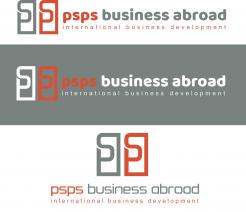
Re branding thus adaptation of current logo
Contest details:
Silver
- Contest holder: Peter Sanders
- Category: Logo design
- Total budget: € 369.00
- Start date : 07-03-2019 17:26
- Ending date : 09-04-2019 15:20
- Status : Ended
- Relevant files: None
-
Available languages:


- Number of designs: 169
-
Response rate:
low high
Needs:
Who are we?
psps develops international sales- and distribution networks, for Dutch and foreign SME’s. Our geographical focus is on the UK, Benelux, DACH region and US. Our customer base comprises of private companies as well as public trade- and investment promotion organizations. Our investment services: numerous business development trips since we started in 1999, created an extensive CRM database, helping us to identify Dutch investors (FDI), in commission of foreign regions and countries.
Our 'why"
Success on international markets is all about building meaningful, long lasting human relationships. Understanding how cultures and markets differ, helps us to gain people’s trust. In doing so, short term business results convert into long term success on international markets. This is our clear commitment, to Dutch and international customers, public as well as corporate.
Our pay-off
BUSINESS ABROAD: GET CONNECTED, GAIN TRUST, GENERATE REVENUE
Name change
From:
psps consultants
export & investment services
To:
psps business abroad
international business development
We have used psps for 20 years, the addition 'consultants' is not always regarded positive in some countries. We want more immediate understanding of what it is we do.
Our demands/expectations
The current colours are e02d29 rood, 6c6d6c grijs. We would like to stick to those colours.
We like the combination of word and image logo components. We like the idea of being able to use these components separately.
The image logo (the square or whatever it will turn into) should be recognizable from a distance. We should be able to use it even in small versions (i.e. business cards).
We would like to stick to lower case lettertype
We do not prefer the use of gradients
Would be preferable if the logo can be used on a white as well as a black background
Pls. do not use stock vectors
Pls. be aware that small adjustments are also welcome. In the current image logo (the square) there is a "C" in the middle, which referred to consultants; this is not relevant anymore in the new name.
Company description:
Target group:
Colors, favourites and other requirements
logomaker
-
-
No comments
-
This contest is finished. Its not possible to reply anymore.
-
-
-
No comments
-
This contest is finished. Its not possible to reply anymore.
-
-
-
Peter Sanders says :
Dank. Zie b en a in visual, mooi gedaan. Versie met verloop kleuren: zie briefing. Visual zelf heeft verder geen betekenis en voegt mogelijk aan zeggingskracht niet zoveel toe. Mooi strak lettertype. 2e tekstregel zeer dun, mss moeilijk leesbaar
-
This contest is finished. Its not possible to reply anymore.
-
-
-
Peter Sanders says :
Dank hiervoor. Fraaie lettering, 2e tekstregel zeer dun. Begrijp betekenis van visual, wereldbol met stippen niet zo bijzonder, andere symbool heeft techniek uitstraling.
-
This contest is finished. Its not possible to reply anymore.
-
-
-
Peter Sanders says :
Dank hiervoor. Beeld voegt wel wat toe, door gebruik wereldbol. Roept iets op van IT vanwege de gebogen concentrische lijnen. Lettering beetje grof.
-
Peter Sanders says :
Dank hiervoor. Beeld voegt wel wat toe, door gebruik wereldbol. Roept iets op van IT vanwege de gebogen concentrische lijnen. Lettering beetje grof.
-
This contest is finished. Its not possible to reply anymore.
-
-
-
Peter Sanders says :
Dank, zie de aanpassing. Beeldlogo is grafische weergave van de letters ps. Zie niet zo goed wat dat over ons zegt (zie briefing deel 'Important')
-
This contest is finished. Its not possible to reply anymore.
-
-
-
Peter Sanders says :
Dank. Zie hoe je met de woord- en beeldlogo componenten kan variëren. Zag als eerste het cijfer 5 in het beeldlogo en krijg dat nu niet meer uit mn hoofd.
-
This contest is finished. Its not possible to reply anymore.
-
-
-
Peter Sanders says :
Zie hierboven.
-
This contest is finished. Its not possible to reply anymore.
-
-
-
Peter Sanders says :
Dank. Door de "knip" in het beeldlogo zien we toch de "C" weer terug waar we vanaf willen. Twee keer psps laten terugkomen legt ongewild nadruk op dat deel van de naam waar het minst zeggingskracht vanuit gaat. Spreekt wel aan dat je iets met labyrint/doolhof hebt gedaan, blijf dat een goed symbool vinden.
-
This contest is finished. Its not possible to reply anymore.
-
-
-
Peter Sanders says :
Dank hiervoor. Zie wel hoe psps in visual fraai is verwerkt, symboliek en dus meerwaarde voor de zeggingskracht logo is ons niet geheel duidelijk.
-
This contest is finished. Its not possible to reply anymore.
-

