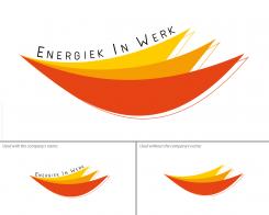
Professional, cool logo with energy for a lifestyle coach and business consultant in vitality
Contest details:
Silver
- Contest holder: anneke peters
- Category: Logo design
- Total budget: € 329.00
- Start date : 24-04-2014 10:22
- Ending date : 08-05-2014 10:19
- Status : Ended
- Required formats: jpg,ai,pdf
- Relevant files: None
-
Available languages:


- Number of designs: 89
-
Response rate:
low high
Needs:
The logo should be used with the campany name: Energiek in Werk
The logo can be used with or without the company name.
The logo is for digital use like a website or in a PowerPoint or Prezi as well for printing like business cards or a leaflet.
Company description:
‘Energiek in Werk’ means Energetic Works
This is my company name.
I’m an lifestyle coach and business consultant for companies to advice them on vitality and sustainable employability.
My advices are all about physics (nutrition, sports, sleep) , emotions and mental behavior to get more energy. ‘manage your energy, not your time’ is my divice.
My core values: sustainable, pure, sports, balance
Target group:
Business
For lifestyle coaching as well: ambitious women with children
Colors, favourites and other requirements
Orange
AM2700
-
-
AM2700 says
The shape I created is - what you cannot see immediately - one quarter of the infinite symbol (that reversed 8) which means that in the endless space of time You coach people to "manage their energy" (as you said). It's also the energy, the mind, the enthusiasm/motivation which is endless. When managing sports, nutrition and sleep (3 colors) you have that "full power" being as "powerful" as a "flame". The three colors together here create that shape which is a union of that balanced physics, (kind of energetic harmony). The yellow color stays also for the sun, the light, the light orange color for creativity/cheerfulness/mind/frequency/dynamism and the reddish orange for the life energy. Furthermore you can see in the shape a part of a muscle structure/cell tissue or blood circulation (physics).
Thus, the shape symbolizes a balance, a bed (whith a bit of imagination;-) ) (feeling at ease/relaxing/sleeping) and a smile. The things You teach/coach people makes them improve their lifestyle, leading a more balanced and therefore a happier life.
The right side or end of the "flames" form a zig-zag shape or shade which makes appear an "E" and simultaneously a "W". They stay of course for "Energy" or "Energiek" and "Works" or "Werk". Even if using the logo without the Name "Energiek in Werk" the logo still contains the initials of the name.
:-) -
This contest is finished. Its not possible to reply anymore.
-

