new brand is looking for a mondern logo
Contest details:
Silver
- Contest holder: schmio
- Category: Logo design
- Total budget: € 299.00
- Start date : 26-03-2014 13:59
- Ending date : 14-04-2014 13:53
- Status : Ended
- Required formats: jpg,psd,ai,pdf, ps
- Relevant files: None
-
Available languages:

- Number of designs: 70
-
Response rate:
low high
Needs:
we need a logo for our new brand. it could be a named logo or a logo with a trademark. we love a modern and simple design (our homepage is flat designed). the most important issue is that our logo has to be reliable to the brand name (feeltastic) and the "feeling" it stands for.
CONTEST IS EXTENDED, due of technical problems (was not able to login and give feedback)
MOREOVER: We als need an app-adaption of the logo for our (android/ios) app. (button-logo)
Company description:
our name = feeltastic
we are a coaching brand, so we coach our members with our app (iOs and android). the app is very simple and playfully. members play the app and get coached in issues like motivation and self-management. our usp is to keep the motivation of people high and coach them to achive their goals.
our slogan: feel tastic. be tastic.
Target group:
Age: 20-40. focus on students, businessmen, athletes.
Colors, favourites and other requirements
no preferences for a color(s), but it/they should(s) stand for happiness/feeling good (feeltastic, but in a casual way. Our most important target groups are business people.
Tjeerd van der Velde vormgeving
-
-
Description by designer Tjeerd van der Velde vormgeving:
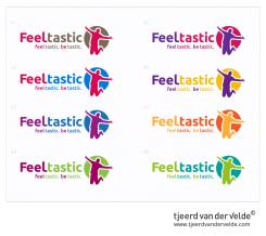
The different color schemes, of course editable to your preferences...
-
schmio says :
wow, really fast respond! great draft - actually the very best one in the contest!!
actually, i prefer the two green ones. whats your opinion? and what do you say to the type? can you also make some diffent type-schemes? -
Tjeerd van der Velde vormgeving says
My opinion is the V3 (purple blue) or the V8 (greens), but it's up to you, what kind of type-schemes do you prefer? playfull or more business-like
-
schmio says :
agree with v3 and v8.
hmm would prefer more business-like! our usp is more on the businesssite... -
Tjeerd van der Velde vormgeving says
Could you give me the url to your business site?
-
schmio says :
yeah, unfortunately it is actually under development. :S
but lets try some business types and give you feed asap
-
This contest is finished. Its not possible to reply anymore.
-
-
-
Description by designer Tjeerd van der Velde vormgeving:
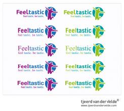
Some type interfaces, they still need some calibration..
-
schmio says :
ty!
would prefer the first row and the last one
-
schmio says :
after you, which "l" ist the better one? just a bar or a bar with a crossbar? i am not sure atm
-
Tjeerd van der Velde vormgeving says
i think it does'nt really matter, it depends on the big picture. In this case i probably would go for the last type..
-
This contest is finished. Its not possible to reply anymore.
-
-
-
Description by designer Tjeerd van der Velde vormgeving:
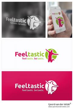
feel tastic, Be tastic! These words fill my creativity and i see a jumping person releasing all his (happy) emotions. I've converted this feeling into a modern useable logo, that fits different media. The brand design works perfect in large and small scale and is useable on different products/ fabrics. I hope i can inspire you with my design!
Friendly regards,
Tjeerd van der Velde -
schmio says :
i really like this jumping person! it really stands for the emotions.
i would prefer, if the "feel" and "tastic" are in different colors - as the second picture. the logo is fine...maybe we can try other color combination to see which is the best one.
best regards,
oliver schmidt
-
Tjeerd van der Velde vormgeving says
No problem i will make some new colorschemes. The "feel" and "tastic" in two colors is the general idea, the picture in the corner shows a preview of window advertising, and the picture below is just a preview how the logo works on a different background color. It's always smart to test the logo in one color, so in the future u will have no problems with it.
-
schmio says :
thank for your respond and information. i am really looking forward for your new schemes.
-
This contest is finished. Its not possible to reply anymore.
-


