Logo & slogan needed for Dutch internet tech startup PowerPanel.
Contest details:
Silver
- Contest holder: joelvanamerongen
- Category: Logo design
- Total budget: € 229.00
- Start date : 14-08-2015 11:56
- Ending date : 16-09-2015 11:53
- Status : Ended
- Required formats: jpg,psd,
- Relevant files: None
-
Available languages:


- Number of designs: 41
-
Response rate:
low high
Needs:
For the logo DON'T use the globe or a server icon in it. we are building on the Material design standard give by Google.
Check the attachment to have an impression on the application dashboard. The color's are open to discuss.
Company description:
Our company PowerPanel has 4 developers / programmers. We have started on 1 juni 2015 and what to go live white a first beta version end of this year. Our headquarters is located in Haarlem.
Target group:
Our customers are designers, creative company's and off course Internet service providers. every one who does business using the internet can use our platform and are potential a customer for our company.
Colors, favourites and other requirements
Use the material design colors from the google specs: https://www.google.com/design/spec/style/color.html#color-color-palette
Strajo
-
-
Description by designer Strajo:
Hi,
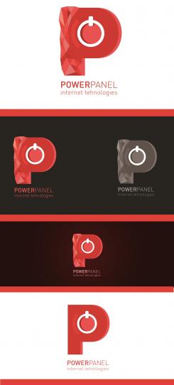
Here is my idea of logo. On the logo I used the red color palet which you have given. The first logo has rough surface on left side because you are building material design standard and symbols which represnt power. On the bottom of my work is simpler logo. I hope that you will like it and feedback. -
joelvanamerongen says :
Thanks for your design, only to logo on the bottom is more in direction. Still it feels not like a real logo. There is missing something.
-
This contest is finished. Its not possible to reply anymore.
-

