No comments
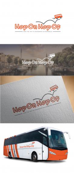
Logo for the Hop on Hop off busline
- Contest holder: AmsterdamWelcome
- Category: Logo design
- Status: Ended
- Files: File 1
Start date: 01-03-2017
Ending date: 08-03-2017
It all started with an idea...
A short, interactive guide helped them discover their design style and clearly captured what they needed.
Brandsupply is a platform where creative professionals and businesses collaborate on unique projects and designs.
Clients looking for a new logo or brand identity describe what they need. Designers can then participate in the project via Brandsupply by submitting one or more designs. In the end, the client chooses the design they like best.
Costs vary depending on the type of project — from €169 for a business or project name to €539 for a complete website. The client decides how much they want to pay for the entire project.
Hi Marko,
could you also make the design with this font but filled?
We would also like to see it on different backgrounds and in different colours.
Thank you.
Kind Regards,
Hi Marko,
could you also make the design with this font but filled?
We would also like to see it on different backgrounds and in different colours.
Thank you.
Kind Regards,
No comments
Can you add an F to Hop on hop OFF?
And could you show us a design with the rabbit without the circle?
Of course!
No comments
Hi M3Kdesign,
This logo is also a nice option, only the bunny does not go with the function of the bus, maybe fill this with a bus?
Furthermore could you change the name to Hop on hop off with double ff?
Kind Regards,
Amsterdam Welcome
Could you after all add the round shape with the rabbit to version 3 the top logo? Without the vertical stripe.
Kind Regards,
Mandy
Of course.
Thank you Mandy.
No comments
yes straight line is better than the other one.
I meant the top logo with version 3 ;)
No comments
Does it look a safely trip for a hop on hop of transportation? The bus looks like falling down.
Not everyone looks the same eyes. Like on an life :Somebody sees it as falling down, but otherone dont. I think it is clear how is about yours.
By the way, this bus instead of harmful smoke ejected four-leaf clover. But you cant see it because you are seeing a 'falling dawn'.
Thank you for your comment, but this bus on this oscilatored line represent something totaly different: the bus stations and the quickly way to drive on it.
It is very nice when you give advice to colleague, but maybe more should you to deal with your own work.
Thank you.
Hi Marko,
Could you make this logo but without the bus and line or in a different way. And could you please also make a different third option with an even more frivolous font.
Kind Regards,
Amsterdam Welcome
"Form follows function”
Thank you.
Dear Amsterdam Welcome,
hi again and here is my vision about this contest.
Hope that you like.
I expect a good and professional feedback as on the last contest.
Best best wishes!
m3kdesign
Hi Marco,
Thanks for your design! We liked the pointer for Amsterdam Welcome but for Hop on Hop off we rather see somethign completely different.
Kind Regards,
Amsterdam Welcome
Thank you for again constructive feedback.
You are the best!
I will create something different for you.
Best wishes!
Marko
 Nederland
 België
 France
 Deutschland
 Österreich
 United Kingdom
