Logo for small strategy consulting firm
Contest details:
- Contest holder: Adri.Kraa@gmail.com
- Category: Logo design
- Total budget: € 100.00
- Start date : 23-08-2012 18:24
- Ending date : 06-09-2012 18:18
- Status : Ended
- Required formats: jpg,pdf,
- Relevant files: None
-
Available languages:


- Number of designs: 65
-
Response rate:
low high
Needs:
The name "STRATEGIES INC." should in a way be explained through the logo- as it signifies our views and approach on strategy consulting. Yes, the name is a bit of a (simple) wordplay for a strategy consulting firm, but the other thoughts behind it relate to the "INCORPORATED"; we help to create strategies that are "Combined, Joined and United into a Structured, Integrated and Coherent Whole" (according to the dictionary). See more on this company approach below...
Looking forward to your ideas!
Company description:
STRATEGIES INC. is an independent boutique consulting firm, advising (inter)national corporations and ambitious start-ups on their growth strategy creation, new business development and organisational transformation.
We believe in a Structured approach: First, harvesting deep external insights and Combining that with the company's real internal potential. Then, Jointly building holistic (Coherent) strategies from the discovered growth opportunities. Finally, Uniting and organising the company to realise the strategy and develop the business as a Whole.
Target group:
We (want to) work for both large multinationals as well as start-ups with international ambitions. Clients could come from various industries but with the common denominator of rapidly changing markets - giving our clients an opportunity and/or need to adapt to this.
STRATEGIES INC. can provide 3 types of service, written as: "Analyse - Strategize - Realise". This could be part of the logo, a subheader?
(as it also indicates our approach...)
Colors, favourites and other requirements
Not a direct preference for colours (although we like orange...) but the logo should not be too fancy or complex. It should come across on a business card and website.
The name STRATEGIES INC. should be there and possible our type of services as subtext: "Analyse - Strategize - Realise".
It should create trust through simplicity, clearness and the message it conveys. After all, it is about the content of our support - not the packaging..
Wilko
-
-
Adri.Kraa@gmail.com says :
looks great!
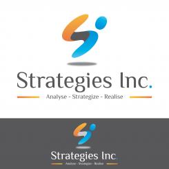
pls tell me your thoughts behind it. What does it represent? How does it symbolise our firm's approach and vision on strategy consulting? -
Wilko says
Hello,
At first the logo represents the "S" and "I" of your company name "Strategies Inc".
More subtly you can see a figure (the "i") which moves forward and encourages us to follow him with his right arm (part of the "S").
Maybe I should extend the "i" or thicken to make it more visible ...
Do you see what I mean?
Sincerly
Stephen
-
Adri.Kraa@gmail.com says :
aha!
Yes, I got it. Took me a while to change perspective (like that picture of a young woman and a old witch all in one...). Brilliant, don't change that!
Just thinking what more messages/symbolism we could incorporate in the picture so it becomes an even stronger story.
I especially want to get the word "incorporated" symbolised in the picture because it is not just a name but our differentiating consulting approach: we follow an holistic approach when creating strategies: incorporating insights from Trends, Market, Consumers and the Company itself. The resulting strategies that we will advise on will then be incorporated in the fabric of the company and its environment. They fit. They are not separate or stand-alone. But integrated, part of the whole and coherent. etc etc
How does that work with your logo? -
Adri.Kraa@gmail.com says :
We have been looking more at it and the votes are spread... We like it but are not sure if it is too 'busy' and not simple enough to come across on a business card.
Can you see if you can simplify it a bit so it will work when printed in small (on business card as example). Maybe less colours, no shadow. Do you need the dark bit in the mid part of the S?
As for the words we can change that later as we like some of the other designs more (all capitals, the subtext bit larger. Dots in between the subtext. Maybe different colour between STRATEGIES and INC.?)
Pls send your next version! -
This contest is finished. Its not possible to reply anymore.
-
-
-
Description by designer Wilko:
Hi, I'm glad to be on the top 3 :)
Ok I erased the shadow effect and put simple colors as you wanted. Moreover I put dots between every words on the baseline. I hope that's what you meant.
Sincerely
Stephen -
Adri.Kraa@gmail.com says :
thanks stephen. we will have to decide tomorrow. after that we probably want some final tweaking (like darker colours: pure orange and the blue that is opposite/complement, no dot at start of subtext, etc)
would you also be able to use it in a further assignment on house style on bus card and website? -
Wilko says
hi, yes of course I will do it
-
This contest is finished. Its not possible to reply anymore.
-
-
-
Description by designer Wilko:
Another colors!
-
Adri.Kraa@gmail.com says :
Hi Stephen,
We like the other colours better, that design is in our top three.
Only concern is still that the logo ( colours) might be too complex ( they are not unicolour but shaded are they?). That will be more difficult on other media in our house style.
Can you simplify , or are they already simple ?
Small points: can you put the dots in subtext lower ( like a full stop) and then after each word - like end of sentence.
Will it look good if subtext is aligned with the name ( just as ' long'), they could be a bit bigger to make it easier to read on bus card.
Thanks -
This contest is finished. Its not possible to reply anymore.
-
-
-
Description by designer Wilko:
Hello,
I have considered your comments and I made these creations.
Sincerely
Stephen -
This contest is finished. Its not possible to reply anymore.
-


