logo for a new watch brand
Contest details:
Bronze
- Contest holder: Davansch
- Category: Logo design
- Total budget: € 269.00
- Start date : 10-02-2020 20:14
- Ending date : 01-03-2020 00:00
- Status : Ended
- Required formats: jpg,psd,ai,eps,pdf en transparante achtergrond.
- Relevant files:
-
Available languages:


- Number of designs: 329
-
Response rate:
low high
Needs:
This is a watch brand and we will develop suitable accessories such as bracelets etc.
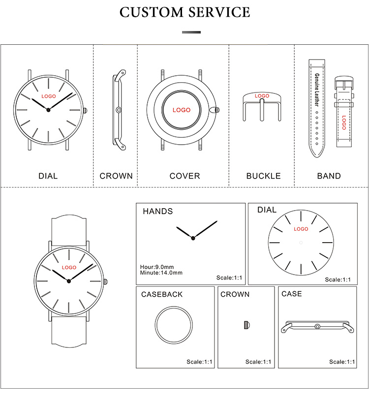
Our target group is men only, so we are also looking for a masculine appearance. We are looking for a design in which we ONLY stand Davansh and this is also clearly legible. On a watch the logo is no larger than 3 by 12 mm so the name must be clearly legible in this small design. To simply write this with Times new novel is very simple;) We would like to find something more design in the name.
We mainly want a logo that is recognizable without the name on it. Think of the M for Mac donalds or the Apple logo. This logo must especially fit on, among other things, the crown of the watch (the wheel on the watch with which you can change the time). This brand logo must therefore be about the same height as it is wide and must be recognizable and stick well.
Company description:
Target group:
Colors, favourites and other requirements
Pray Art
-
-
Description by designer Pray Art:
Dear Ch.
I was read your brief.
Let me explain my logo.
In this logo was made very MASCULINE there is no curve in the brandmark, and all black because black is CLEAR, DEEP, GLAMOR, SERIOUS.
With black this logo will LEGIBLE in the watch.
Black is color of class, black is WE ARE WHO WE ARE
This logo contain brand mark and letter mark.
The brand mark high and wide is same.
The wide of lettermark is 2x following wide of brand mark.
For the negatif space between brand and letter is 0,88 of letter hight.
I try to balance when brand and letter togheter.
You can use this logo for brand or letter alone, or combine whith the rule i gave.
Best regard
-
This contest is finished. Its not possible to reply anymore.
-
-
-
Description by designer Pray Art:
Dear Ch.
I was read your brief.
Let me explain my logo.
In this logo was made very MASCULINE there is no curve in the brandmark, and all black because black is CLEAR, DEEP, GLAMOR, SERIOUS.
With black this logo will LEGIBLE in the watch.
Black is color of class, black is WE ARE WHO WE ARE
This logo contain brand mark and letter mark.
The brand mark high and wide is same.
The wide of lettermark is 2x following wide of brand mark.
For the negatif space between brand and letter is 0,88 of letter hight.
I try to balance when brand and letter togheter.
You can use this logo for brand or letter alone, or combine whith the rule i gave.
Best regard -
This contest is finished. Its not possible to reply anymore.
-