Creation of a Logo for a french theater compagny
Contest details:
- Contest holder: Anna Deleuil
- Category: Logo design
- Total budget: € 100.00
- Start date : 15-04-2019 18:49
- Ending date : 29-04-2019 00:00
- Status : Ended
- Relevant files: None
-
Available languages:


- Number of designs: 118
-
Response rate:
low high
Needs:
I’m creating a theater company; thus I have a very small budget but truly need a logo.
The company
My company’s called “La Nuit Noire” (so literally “The Black Night”, or “The Dark Night”). The plays consist of contemporary theater (without being too abstract) and deal with themes like marginality, insomnia, substance addiction, anger and how dark a party can get. The aesthetic goes from raw to dreamlike. Although the plays take place in a contemporary world, they always are more or less inspired by dark versions of fairytales (Peter Pan, Alice in Wonderland, Pinocchio, The Little Red Riding Hood).
The logo
I’m thinking of an animal, which could represent or be an allegory of night; especially a wolf or a cat. However, I would like to avoid the cliched wolf howling at the moon or cat on top of a roof at night, because they could make the company look too cute, which I would like to avoid. The animal can have a physical flaw as if it was injured: be too skinny, have a torn ear, a scar or something similar. Concerning its expression, it can have an air of defiance or look like it’s containing its anger without looking too aggressive. It should look threatening though.
The animal can be seen from behind, the front, the side, sitting, shown entirely or partially obscured (in the latter case, I’d like to be able to see or infer the beginning of its neck).
Other ideas
Thinking of a wolf led me to the idea of a pack of wolves in the shade, which I quite like.
The animal’s eye or eyes can be one or two moon(s) (probably full ones) to create a weird effect, just like one of the files I’m adding to this post.
The animal can be anthropomorphic (but shouldn’t look childish or like it belongs to a character from fashion commercials). For example, it can wear a sweater/hoodie, smoke a cigarette etc. It shouldn’t look too fashionable: no suit or cocky expression.
The colors
Considering the company’s name, I think I need the logo to be quite dark. I think I want to avoid very clean styles (for example, a drawing of a wolf with thin black lines with a white background) so that it doesn’t look like a brand logo. However, I like the sketch aesthetic, the use of black and white and of strong contrasts. For example, I like Frank Miller’s aesthetic in Sin City.
I am open to other suggestions: especially concerning the use of blue. The atmosphere can also be dreamlike or psychedelic but not too sweet or poetic.
ATTENTION
Since the company is from Lyon, France, I want to avoid it looking too similar to the local rugby team logo (the LOU).
Thank you for reading my post. I know it’s a long one but I wanted to mention as many ideas as possible.
Have a nice one
Company description:
Target group:
Colors, favourites and other requirements
selenia
-
-
selenia says
Bonjour,
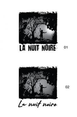
Voici une première proposition. J'ai créé une atmosphère, j'espère qu'elle vous plaira!
N'hésitez pas à me faire part de vos impressions et notifications.
Cordialement,
selenia
-
Anna Deleuil says :
Bonjour !
J'aime assez cette proposition je pense que la silhouette de l'enfant peut être dans une posture plus soft ou moins "naïve" si je puis dire (je ne sais pas trop comment formuler ^^ ) Je crois que je préfère le 01, la typo me parait la plus interessante, et la lumière ajoute quelque chose que j'aime bien. Merci pour ces essaies ! -
selenia says
Merci, pour le commentaire!
je vous fait les changements. -
This contest is finished. Its not possible to reply anymore.
-

