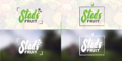
Who designs our logo for Stadsfruit (Cityfruit)
Contest details:
Bronze
- Contest holder: Stadsfruit
- Category: Logo design
- Total budget: € 229.00
- Start date : 16-12-2016 16:00
- Ending date : 23-12-2016 15:59
- Status : Ended
- Relevant files: None
-
Available languages:


- Number of designs: 144
-
Response rate:
low high
Needs:
We are a start-up based in Utrecht (the Netherlands) and our business is focused on fruit! Our core business: delivering fruit (boxes) to companies. Our fruit comes mainly from local farmers and eventually ends up in the city. Hence the name: Stadsfruit which means City Fruits. Not organic but locally.
Besides supplying fruit crates we process our fruit in smoothies and juices that we cater to companies with smoothie bars on site. For our smoothie bars we also want to use the logo. Our main target are thus companies, but in the summer we are also at festivals selling smoothies and fruit to consumers.
But first a suitable logo that should emit the following core values:
- Fruit
- Healthy
- Local (from the farmer to the city)
- Fresh / Hip brand
- Professional
We are looking for a fairly neat logo with few frills.
The logo will, of course, be used for communication expressions. So online on our website and social media, as well as offline folders, business cards, stickers, etc.
Company description:
Target group:
Colors, favourites and other requirements
TeddieDesigns
-
-
Description by designer TeddieDesigns:
2 verschillende uitwerkingen
Links: StadsFruit met twee hoeken die op een subtiele manier de box voorstellen. Met de sterretjes voor de extra look. Simpel en fris logo.
Rechts: Ongeveer hetzelfde als het linkse logo maar hierbij de box duidelijk aangegeven maar ipv een lus op de box twee blaadjes.
Het logo is fris en hip gehouden waar het gezonde / fruit in terug komt. Maar toch professioneel overkomt.
Het is een logo wat makkelijk te herkennen zal zijn vooral in lokaal gebruik. -
This contest is finished. Its not possible to reply anymore.
-

