Brochure OST DEVELOPPEMENT
Contest details:
Silver
- Contest holder: ost
- Category: Flyer, tickets
- Total budget: € 259.00
- Start date : 11-05-2016 11:33
- Ending date : 09-06-2016 11:11
- Status : Ended
- Required formats: jpg,ai,pdf
- Relevant files: None
-
Available languages:


- Number of designs: 29
-
Response rate:
low high
Needs:
1 Sales Brochure with a 4 faces folder design
Size:
A4 + Double folder with right internal pocket + 2 slots to insert a visit card
Please see attached the layout to work with.
Our reasons for this brochure:
We wish to provide to our commercial teams a practical, simple and functional tool, graphically attractive, multi-use: a sales support, the business card, in which we could left many insert flyers of our products after a meeting.
The corporate image that we want to show is the one of a modern and technical company which product are high-end, leader of the bone graft market in France.
Our sale force is mainly composed of independent sales agents working for different companies offering the various types of implants that can be used during a specific surgical procedure. Our product usually weights less than 10% in their portfolio.
Company description:
OST-DEVELOPPEMENT is French company that was created 23 years ago, manufacturing bone substitutes of human (called allografts, brands OSTEOPURE and ALLODYN) or animal (called xenografts, brands LUBBOC/ LADDEC) origin.
Bone substitutes sterile products intended to be surgically implanted used in various medical indications: Orthopedics, spinal surgery, dental surgery, maxillofacial surgery, traumatology etc…
Because some of our products are of human origin (femoral heads recovered from living donors undergoing hip arthroplasty surgery) we have to be certified as a Tissue Bank.
Our finished product are composed exclusively of bone, they are the result of a complex cleaning process applied to raw bones, involving different human, technical, regulatory, quality and clinical knowledges.... What we do can be related to “tissue engineering”.
The purpose of this cleaning process is to eliminate any microbiological risk, to offer products whose shapes are adapted to specific anatomical sites, to ensure that the natural porosity of the bone is optimized (the trabecular structure of bone). A good process like ours reaches these objectives with methods and products that are not detrimental to the natural mechanical strength of the bone.
The growth of our revenues and the ambitious researches of development projects should make us pass through in the coming years.
Target group:
Main target:
Surgeons (orthopaedics, stomatology, dental, spine, ENT, maxillofacial)
Audience :
Nurses (surgical unit)
Hospital pharmacist
Buyers
Hospital Director
Trading houses
Colors, favourites and other requirements
Shade:
Modern
Technic
Comforting
Must be visible and attractive
Colors:
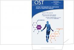
Traditionally the corporate color of OST was the blue (attached the OST logo and the OSTEOPURE logo which is the leading brand in our portfolio), the product colors are also defined (see files attached). But we are open mind.
The background should show a technical image.
Font:
Easy and clear to read. A little preference for rounded fonts
All the capitals letters should have their accent.
Freddy
-
-
Description by designer Freddy:
2 eme proposition sur gabarit pochette. dans l'attente de vos retours
-
ost says :
Dans l'idée les éléments présents sur votre créa correspondent à la première de couverture. L'idée étant surtout de créer un fond de page technique pour déclinaison et calage des autres pages.
-
This contest is finished. Its not possible to reply anymore.
-
-
-
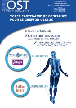
Description by designer Freddy:
Bonjour
je vous soumets la première page de la plaquette avant d'aller plus loin, en effet toutes les autres pages seront une déclinaison de la 1ere page. -
ost says :
Bonjour et merci de votre proposition.
Les flèches renvoyant les allogreffes (être humain sur être humain) et xénogreffe (greffe de grefon d'origine animale sur être humain) donne l'impression d'être respectivement lié a de la chirurgie de la main et du pied (uniquement!). Ce qui n'est pas le cas dans les faits.
Je ne suis donc pas convaincu par le dispositif et de nouveau le fond ne me parait pas assez technique...
Par ailleurs les éléments d'adresse ne doivent pas paraître sur la première de couv'.
Cordialement, -
This contest is finished. Its not possible to reply anymore.
-