looking for logo (for use on business card & website) for my company (www.loekintofood.com)
Contest details:
Bronze
- Contest holder: Loekintofood
- Category: Business card
- Total budget: € 129.00
- Start date : 25-03-2017 22:46
- Ending date : 20-04-2017 00:00
- Status : Ended
- Relevant files: None
-
Available languages:


- Number of designs: 105
-
Response rate:
low high
Needs:
See my company description below (www.loekintofood.com):
How does what we eat impact our health? This entails designing nutrition science, and understanding what its outcomes mean - and not mean.
How to apply such understanding to better health - how to make it land on our plates? This may happen via food & diet composition, guiding (re)formulation, truthful & meaningful claims & medical foods, regulatory aspects, nutrition policies, communications, trainings
lt is around these questions that Loekintofood offers expertise, insights and other inputs.
Company description:
Target group:
Colors, favourites and other requirements
bartous
-
-
No comments
-
This contest is finished. Its not possible to reply anymore.
-
-
-
Loekintofood says :
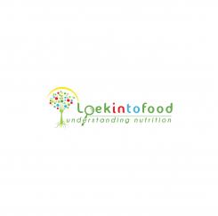
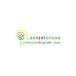
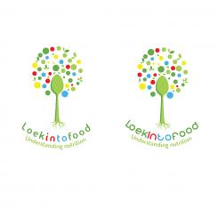
nice! you can keep the different colours 'fruits' in the tree though, that was nice! also the yellow arch. and differentiate 'in' from 'to' in 'into. Because loekintofood can be read as loek into food and looking into food..
And shall we keep for the rest all green..?
and understanding nutrition in italic would be nice
today we need do complete - competition ends tomorrow! -
Loekintofood says :
and: use the O in Loek to show a magnifying glass (loep in nederlands), with the handle (perhaps in yellow as well, like the bow around the tree, like you had before) sticking out to 'north-east". To do so, make that O fully round/circular, and make it somewhat bigger than the other letters, to express the 'magnifying". like that we express also visually the 'looking'...
-
This contest is finished. Its not possible to reply anymore.
-
-
-
No comments
-
This contest is finished. Its not possible to reply anymore.
-
-
-
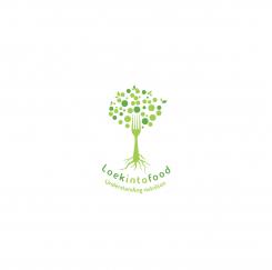
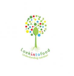
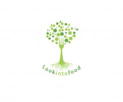
Loekintofood says :
this positioning is better I think. better to put back the fork, as the teeth of the fork kind of mirror the roots.. and the roots you could make less branched, more slick - so they resemble a bit more the teeth of the fork. and see if you can differentiate the font of "understanding nutrition" from "loekintofood". Perhaps understanding nutrition" in italic
-
Loekintofood says :
all in all better to go back to the original first design.. put back the fork, as the teeth of the fork kind of mirror the roots.. and the roots you could make less branched, more slick - so they resemble a bit more the teeth of the fork. And add "understanding nutrition"
-
Loekintofood says :
can you put back the fork? as the teeth of the fork kind of mirror the roots.. and the roots you could make less branched, more slick, and a bit bigger than you made them here (now too miniature) - so they resemble a bit more the teeth of the fork.
Note the competition ends in 1-2 days.. -
This contest is finished. Its not possible to reply anymore.
-
-
-
No comments
-
This contest is finished. Its not possible to reply anymore.
-
-
-
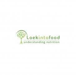
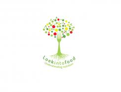
Loekintofood says :
nice! i like the colours, though some friends tell me they like the 'peacefulness" of having just green - but I like the colour I think.
Could you make the roots less detailed, a bit less branched, more 'slick'?
then the font: what other font type would fit wel? this one is so so
thx! -
This contest is finished. Its not possible to reply anymore.
-
-
-
Loekintofood says :
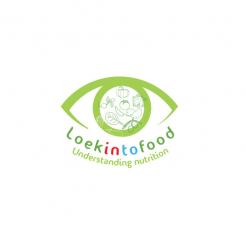
seeing it, I think the eye does not work so well - your trees are much more effective :-)
-
This contest is finished. Its not possible to reply anymore.
-
-
-
Loekintofood says :
seeing it, I think the eye does not work so well - your trees are much more effective :-)
-
This contest is finished. Its not possible to reply anymore.
-
-
-
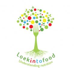
Loekintofood says :
excellent :-) I see now though that it is better to have a 'round' cloud of fruits/dots/leaves; a round tree top rather than the eye shape I had in mind.
and what you think of making the roots more 'simple'? I mean less branched out, smoother?
I do like the green with the colours, then, the red and blue in loekintofood are perhaps to harsh compare to the more subtle green? how would it look to make the green letters darker green?
Finally, now would it look with spoon instead of fork? Or do we then loose the 'symmetry' between roots and fork-pins..? -
This contest is finished. Its not possible to reply anymore.
-
-
-
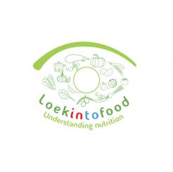
Loekintofood says :
very good! and if you give "in" and 'to" different colour, it would show you can read loek into food and looking into food..
-
Loekintofood says :
very good! and if you give "in" and 'to" different colour, it would show you can read loek into food and looking into food.. The top part now has indeed eye shape, but not sure anyone will see that.. let me think about it.. perhaps you have other ideas
-
Loekintofood says :
very good! and if you give "in" and 'to" different colour, it would show you can read loek into food and looking into food.. The top part now has indeed eye shape, but not sure anyone will see that.. let me think about it.. perhaps you have other ideas
-
This contest is finished. Its not possible to reply anymore.
-
-
-
Loekintofood says :
well done - aesthetic and subtle. I am thinking if the top of the tree could even be in eye shape (it is already almost), to represent looking.. indeed all green, or include like yellow (son), blue (water), red (fruit) And perhaps there is a way to show that loekintofood can be loek into food, but also 'looking to food. And "understanding nutrition" would be good to include
-
This contest is finished. Its not possible to reply anymore.
-