looking for logo (for use on business card & website) for my company (www.loekintofood.com)
Contest details:
Bronze
- Contest holder: Loekintofood
- Category: Business card
- Total budget: € 129.00
- Start date : 25-03-2017 22:46
- Ending date : 20-04-2017 00:00
- Status : Ended
- Relevant files: None
-
Available languages:


- Number of designs: 105
-
Response rate:
low high
Needs:
See my company description below (www.loekintofood.com):
How does what we eat impact our health? This entails designing nutrition science, and understanding what its outcomes mean - and not mean.
How to apply such understanding to better health - how to make it land on our plates? This may happen via food & diet composition, guiding (re)formulation, truthful & meaningful claims & medical foods, regulatory aspects, nutrition policies, communications, trainings
lt is around these questions that Loekintofood offers expertise, insights and other inputs.
Company description:
Target group:
Colors, favourites and other requirements
krisi
-
-
krisi says
Hello,
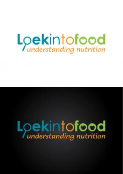
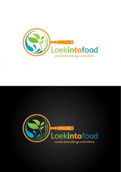
I think if I use "O" like magnifying glass it will be too busy to put pear and wheat halm in it. Also they will too small and difficult for understanding. This is the reason why I don't put nothing in it. But I think in this way Loek expresses the looking and Food the food.
Let me know what do you think,
Krisi -
Loekintofood says :
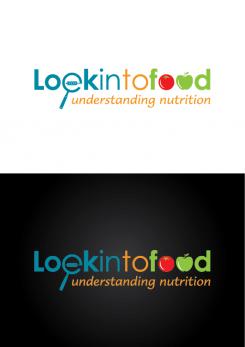
I see what you mean krisi... we can keep it simple like this, or make the inside of the O in Loek larger than the other letters (so it is magnified..) and then put a wheat halm in it,...
And the two OO in food: the fruits are not yet so clear; what about making one O all solid red and a green leave stick out like a leave so it is more clearly a tomato, and similarly for the other O in solid green e.g. as apple (with also leave/little stem stick out of the O)... or another fruit or veg that you think can be depicted well and clear. what you think? -
This contest is finished. Its not possible to reply anymore.
-
-
-
krisi says
Hello,
here how it looks like with "e" as a magnifying glass.
I am not really sure if it's look better....I don't know if it's enough readable.
-
This contest is finished. Its not possible to reply anymore.
-
-
-
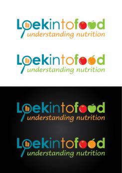
krisi says
Hello,
I make one version with apple and second with orange.
Let me know what do you think.
Regards,
Krisi -
Loekintofood says :
excellent! we may still play with font - what y9ou think; keep it slick like this?
-
krisi says
I think we should keep font as simple as possible because it may become too busy (if you know what I mean). We have too much elemnts inside this logo and best way is to keep font style like this ( my opinion). Still if you have some idea that you want to see is not a problem.
-
Loekintofood says :
i agree indeed - keep the font. One more idea to make it perhaps even smarter: use not the O, but the e (in Loek) for the magnifying glass. The circle wil then not be fully closed, and for the horizontal line in the letter e you can put the wheat halm (horizontally).. What you think?.
-
This contest is finished. Its not possible to reply anymore.
-
-
-
No comments
-
This contest is finished. Its not possible to reply anymore.
-
-
-
Loekintofood says :
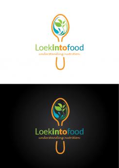
nice! could you make the handle more slick / just one same thickness;? And I wonder: if you use the first O in Loek for the magnifying glass with handle (and inside have like a pear instead of the wave, and a wheat halm instead of the leaves), and the OO in food to show 'food' e.g. a tomato and apple..? what you think? then Loek expresses the looking and Food the food..
-
Loekintofood says :
and what is your ideas for font? the current one is slick a formal - could be good. or something smoother - to go better with the subheading font (which can be a bit larger maybe?
-
This contest is finished. Its not possible to reply anymore.
-
-
-
krisi says
and here one more version...
-
Loekintofood says :
I got an error message - not sure you got my last thoughts.. To be sure I send again: ""One more thought: perhaps the spoon is too much 'restaurant'. Why not change it to a magnifying glass? for the round glass itself you then use the round shape you had in the beginning. And "Loekintofood" and "understanding nutrition" go underneath the handle. Handle can be to the right or to the left.. what you think?"
-
krisi says
I receive this message. Tomorrow I will make version with magnifying glass.
-
This contest is finished. Its not possible to reply anymore.
-
-
-
krisi says
Hello,
here new version of logo with whole spoon.
Let me know if you want to change something more.
Regards,
Krisi -
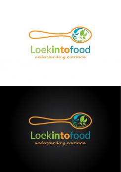
Loekintofood says :
very good - i think the horizontal spoon works better than the vertical one... I need to think now what to do - will get back to you, thx
-
krisi says
Ok. Thank you
-
Loekintofood says :
One more thought: perhaps the spoon is too much 'restaurant'. Why not change it to a magnifying glass? for the round glass itself you then use the round shape you had in the beginning. And "Loekintofood" and "understanding nutrition" go underneath the handle. Handle can be to the right or to the left.. what you think?
-
krisi says
Not a problem. I will work on it.
-
Loekintofood says :
I got an error message - not sure you got my last thoughts.. To be sure I send again: ""One more thought: perhaps the spoon is too much 'restaurant'. Why not change it to a magnifying glass? for the round glass itself you then use the round shape you had in the beginning. And "Loekintofood" and "understanding nutrition" go underneath the handle. Handle can be to the right or to the left.. what you think?"
-
This contest is finished. Its not possible to reply anymore.
-
-
-
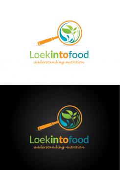
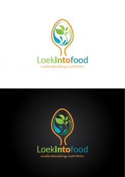
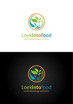
Loekintofood says :
very appealing. I see water, plant - and egg. And the spoon..:-) Now, I had in mind: turn the spoon 90 degree, draw the whole length of the handle, and put the words under the length of the handle.. what you think?
-
This contest is finished. Its not possible to reply anymore.
-
-
-
krisi says
Hello,
here new variation of logo.
Let me know if you want to change something.
Regards,
Krisi -
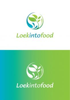
Loekintofood says :
i like the look of it, and the colours.
I am thinking though it is now kind of "agri" - not so clear it has to do with food. what about getting a spoon in, make the current circle into ellips as part of a spoon? and the name and subtitle under the spoon handle? -
krisi says
Hello,
thank you for your comment. I can make this changes but your contest is already finish. If you give me your personal e-mail I can send you some version with spoon in it.
Regards,
Krisi -
This contest is finished. Its not possible to reply anymore.
-
-
-
Loekintofood says :
well done - nice blue/green water/plant combi. yellow (sun) and red (fruit) are also nice, but would make it into a rainbow... perhaps too much?. Could work more with the font maybe. And perhaps there is a way to show that loekintofood can be loek into food, but also 'looking to food. And "understanding nutrition" would be good to include
-
This contest is finished. Its not possible to reply anymore.
-