Cuckoo Sandbox
Contest details:
Gold
- Contest holder: jbremer
- Category: Business card
- Total budget: € 279.00
- Start date : 30-05-2015 10:33
- Ending date : 27-06-2015 10:30
- Status : Ended
- Required formats: jpg,ai,pdf
- Relevant files: None
-
Available languages:


- Number of designs: 49
-
Response rate:
low high
Needs:
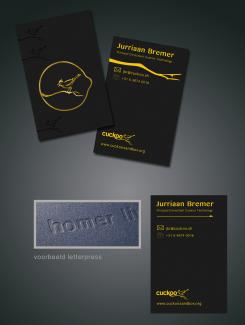
Name: Jurriaan Bremer
Job title: Principal Consultant Cuckoo Technology
Email: jbr@cuckoo.sh
Optionally my website: jbremer.org
Optionally my phone number: +31 6 4674 0016
I have attached my old business card "design" which was a default vistaprint design that I liked quite a bit - so a bit darker colors would be cool, but with the logo (cuckoo.png) the colors can't be very dark, as that would render the logo useless (I guess).
Furthermore, you can't see it on the uploaded image (old.jpg), but with that business card I had the option in vistaprint to use "metallic print", which highlighted some of the text. That was pretty awesome and if possible I'd definitely like to see that again in the new design.
Company description:
I work in the IT Security / Cyber Security area.
Target group:
My services (consultancy) targets Cyber Security companies.
Colors, favourites and other requirements
bianca jonker
-
-
Description by designer bianca jonker:
Hello, Here is my design . It is a design for a leetterpress ticket . With patience and precision , the letters are pressed into the paper , creating a raised edge , also called must . This text extremely sharp eyes and get it printed an extremely exclusive appearance. (google on letterpress for more information) In the background the birds in black. Cuckoo pops out and is so different from the other birds. Tight font in gold foil . Dark black natural paper. The cuckoo logo is to small for use in a design that's why its not that tight. But we can arrange that later. Hope to hear from you! Bianca
-
jbremer says :
I like the back and foreground on the top of your design - the one of the bottom not so much. Nice one..
-
bianca jonker says
What do you think of the letterpress technique? It is a technique where you use simple colors and let the paper and pression do all of the work. If you would like to see a variation that can be used for a normal printing technique?
-
bianca jonker says
al the icons can easily be changed, also after the competition. We can work on untill its totally the design you like!
-
jbremer says :
Would be nice to see some variations of course, but I think the technique looks nice.
-
bianca jonker says
Hello,
Sophie jade uses the same technique i told you about. The letterpress technique. This design would look the same as she showed in her design. That's why i put the little square with homer. I only used a more yellow gold foil. You can make your card at: http://www.studio-esteban.com/nl/letterpress-naamkaartjes/colorplan-black
Have a nice evening,
Bianca -
This contest is finished. Its not possible to reply anymore.
-